The founder is proud of the new formula. The marketing deck is full of reasons to love it. Then we put everything on a carton and the front panel starts shouting. In the studio it feels exciting. On shelf it feels crowded. A shopper stops for three seconds, skims the top line, and moves on.
Here is the quiet truth: voice drives choice. A clear, human tone makes a pack feel trustworthy before a shopper even reads the details. We do not need more words – we need the right words, in the right order, sized for distance, and written for a moving person with a basket in one hand.
What’s Really Going On
Most packs try to do three jobs at once: announce the brand, explain the product, and justify the price. When those messages fight, the design has to shout. When the tone is clear, the design can breathe.
Shoppers read in layers. First they take the billboard read – brand, product type, variant color. Only after the hand reaches for the pack will they scan claims and microcopy. If that first layer is not calm and obvious, nobody reads the second. If you have not tuned your layout for the three second pass, this will help: Shelf Power: Design for Distance, Win the 3-Second Read
The Practical Fix (Production-Savvy)
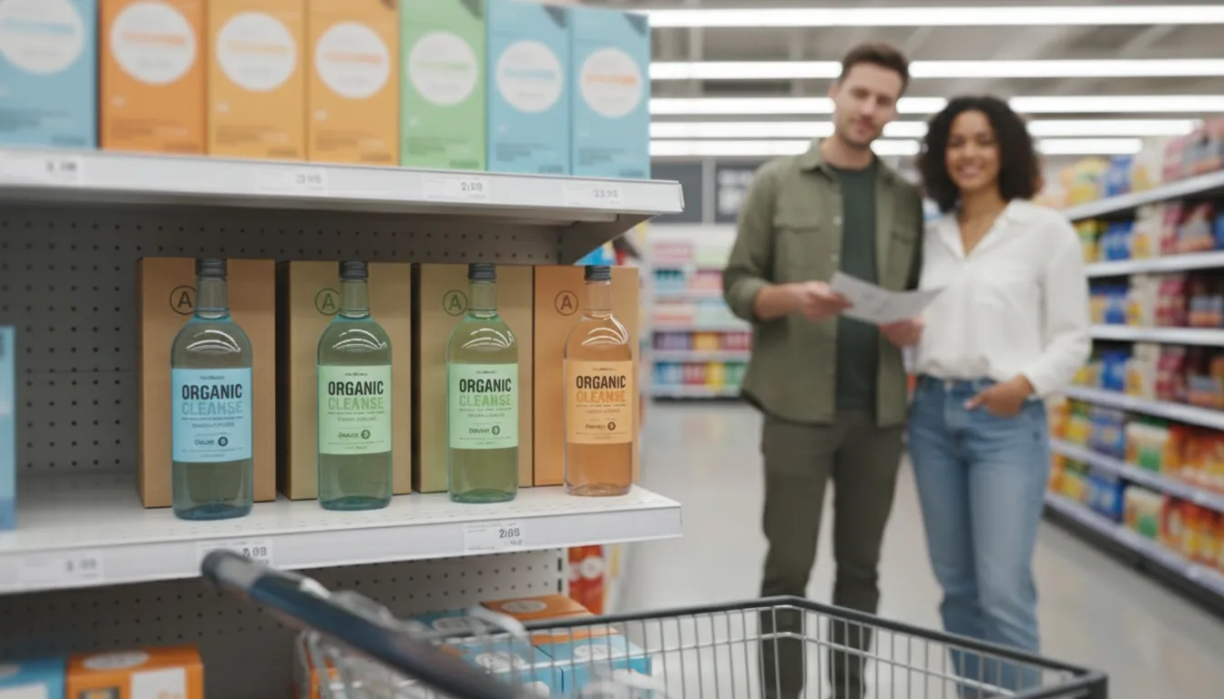
Let us sit with a real example. A new cosmetics variant needs to feel gentle and efficient. The team has thirty bullets. We will keep five lines.
Front story – the first handshake.
One promise line that earns the reach: Gentle daily cleanser for sensitive skin. That is it. No exclamation points. No jargon. The logo and product type stay large enough to read from three meters. Color does the rest.
Back story – proof without noise.
Three short sentences, not a brick of text:
- Cleans and calms – fragrance free.
- Dermatologist tested – pH balanced.
- Made for daily use – face and eyes.
Simple rhythm. Every dash avoids a caveat. The voice is calm and useful, not breathless.
Claims that pass the eyebrow test.
If a claim might trigger a legal review, we write it precisely and place it where it will not disrupt the read. We also avoid double negatives and hype adjectives that create doubt.
Ethical note: production guidance, not legal advice. Confirm local regulations and retailer requirements before release.
Microcopy that helps the hand.
On narrow panels and labels, we write like signage: Shake gently. Apply to wet skin. Rinse well. Verbs first. Short words. No nested clauses. This is not dumbing down – it is respecting the moment of use.
System, not one-off.
Tone only scales when it lives inside your templates. We keep fixed zones for logo, product type, and key proof, then give microcopy a consistent home so variants do not invent a new voice each time. If your team ships many SKUs, a template approach cuts mistakes and speeds approvals – see Reprint-Ready Templates: Cut Prepress Time by 30%.
Proof it like design.
We print at actual size, place the pack three meters away, and read the front aloud like a shopper: brand, type, one promise. If we stumble, we edit. Then we check hierarchy under store LEDs. If the voice still feels calm and clear at distance, the copy is working.
Short-Term Wins (This Week)
- The pack stops shouting. Key promise reads in one breath.
- Faster approvals – fewer rewrites and fewer layout breaks.
- Clearer on-shelf story that works from three meters, not just in a PDF.
- Ops relief – less last minute text squeeze on labels and sleeves.
Long-Term Wins (This Quarter or Year)
- A recognizable voice across sizes and formats – stronger brand memory.
- Fewer legal hiccups because claims are precise and consistently placed.
- Faster range extensions – the tone and the placement rules are already decided.
- Better reviews and fewer returns because usage copy is actually helpful.
Final Thought
Good tone is not cute. It is useful. It respects the shopper’s time, supports the design, and holds the brand together when your line spreads across variants and markets. Calm words sell.