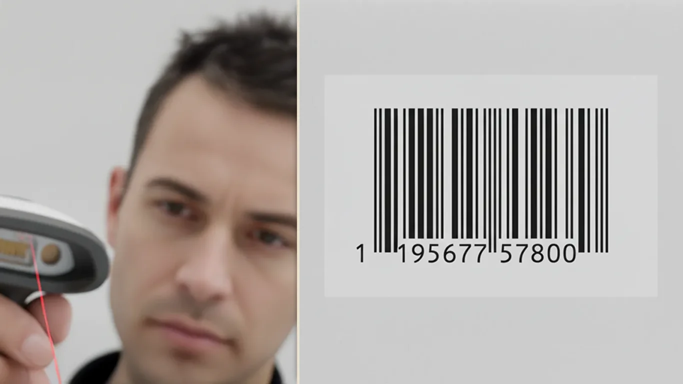
If a barcode fails, nothing else matters. Use this calm, production-savvy guide to make codes scan first time on cartons, films, and curved bottles - without killing your design.
Adding SKUs should not dilute recognition. This playbook shows how to expand sizes and formats while keeping a calm 3 second read and tight production control.
A calm, production savvy way to cut material waste and cost - standardize your carton, label, and tray components so every print sheet and die station works harder.
Microcopy that sells without shouting. A calm, useful tone makes the pack readable at distance and helpful in the hand - and it scales across variants when baked into your templates.


