Picture this: you’ve approved a beautiful clear label for a chilled drink. On screen, it looked perfect—clean window, crisp logo, vivid color. First samples arrive and… the red looks tired, the barcode struggles to scan, and that “transparent” window feels foggy. Nothing “wrong,” but nothing right either. The problem isn’t your brand; it’s the white ink underprint you didn’t plan for.
With the right white layer strategy – and a fast proof – you can lock color, keep windows crystal clear, and avoid costly reprints.
What’s Really Going On
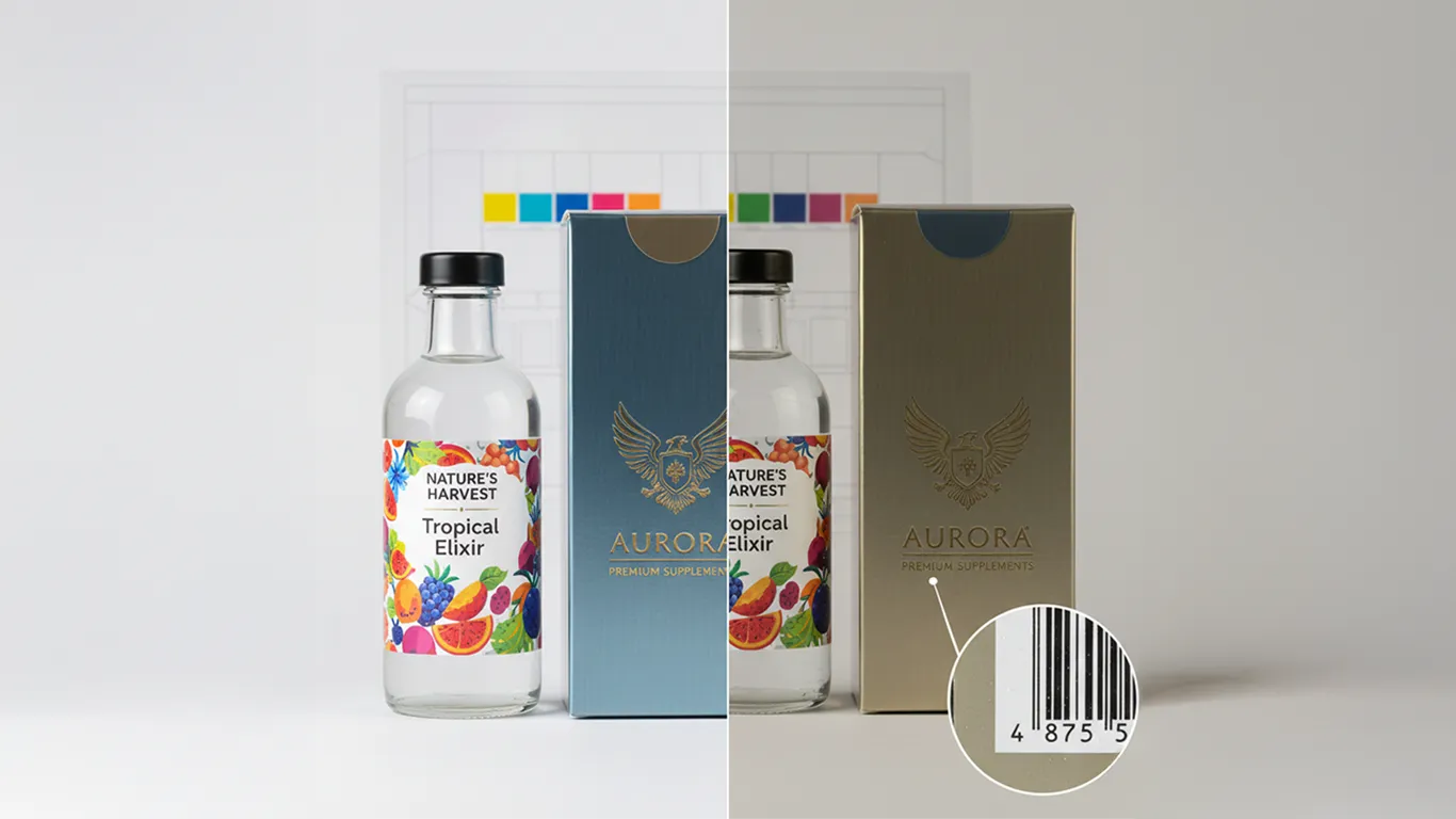
CMYK is translucent. On clear films and metallic boards, light passes through inks and picks up whatever’s behind them—glass, liquid, adhesive, silver. Without a white base, colors shift dull or dirty; on metallic, everything turns “metallic” (even the barcode) unless you tell it not to. White ink acts like paper: an opaque base that makes colors read true and keeps key elements—logos, text, codes—legible. The trick is control. You don’t want white everywhere. You want it where brand color must be solid, you don’t want it where you need true transparency (windows), and you may want partial white where you want a soft metallic sheen. That control lives in a dedicated “white underprint” plate, built as a spot color and set to overprint—then proofed on the actual substrate under realistic lighting.The Practical Fix (Production-Savvy)
1) Decide the underprint strategy upfront.- Full flood white: everything gets a solid base. Maximum color punch; no metallic look.
- Selective white: only under logos, text, photos, and the barcode area. Leaves windows clear and chosen zones metallic.
- Tinted metallic: underprint white at, say, 50–70% in chosen areas to keep a gentle metallic glow. (Check with your printer—some processes don’t support screened white cleanly.)
- Create a spot color named clearly, e.g., WHITE_UNDERPRINT (100% swatch).
- Place it on a dedicated top layer in your design file (so you can see coverage), but set the spot to Overprint so the RIP handles it as an underprint in production.
- Choke the white slightly (0.15–0.25 mm) so you don’t get a white “halo” if registration shifts.
- Keep fine type and barcodes on solid white—no screens.
- For images, vectorize the white shape or use a clean spot channel; avoid noisy masks.
- Surface print vs. adhesive-side print: if the art is mirrored and printed to the inside, white often sits between two ink layers for durability. Clarify with the printer.
- Windows: 0% white = true transparency. Add a hard vector edge to keep the window crisp; avoid fuzzy masks that look milky.
- Condensation test: for chilled products, request a prototype and chill it—fog reveals weak edges or micro-coverage issues.
- Anything with no white reads metallic. Skin tones and food can look weird if you forget. Decide which areas should be paper-like (with white) and which should shimmer.
- Avoid screened white below ~30% unless your print method can hold it smoothly; better to simulate a softer metallic with CMYK values over solid white or use vector patterns.
- Always put solid white under the barcode and critical microtype. Keep the quiet zone free of graphics and varnish textures. If you’re using a matte varnish, extend it under the code to reduce glare. (Production guidance, not legal advice; confirm local rules and retailer requirements.)
- Drawdowns: ask for white + CMYK drawdowns on the actual clear film or metallic board.
- Contract proof: simulate white underprint + CMYK on the correct substrate, viewed under D50 and also under store lighting (LED/fluoro).
- In-hand prototype: a short in-house run on clear BOPP or metallized PET tells the truth—especially for windows, edges, and condensation.
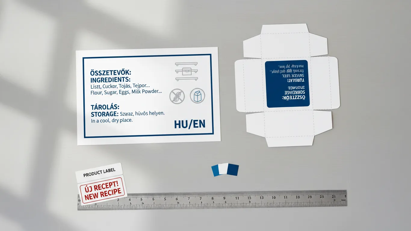
- Deliver a 3-page PDF:
- Page 1: art + dielines (dielines as spot strokes set to overprint).
- Page 2: art-only (RIP-friendly—no dielines).
- Page 3: diecut-only plate (spot strokes for cut/crease/perf/glue).
- Include the WHITE_UNDERPRINT spot in Pages 1–2, set to Overprint.
- Note print side (surface vs. adhesive) and any choke value in the slug.
- Reference your online brand book (WordPress/Elementor on your server) with a page that documents white ink usage: when to flood, when to window, barcode base, and do/don’ts. Downloadable swatches and sample files live there for your team.
Short-Term Wins (This Week)
- Colors stop looking “washed out” on clear and “oddly shiny” on metallic—your brand reads as intended.
- Barcodes scan reliably, cutting delays at delivery checks and retail.
- Faster approvals: one accurate substrate proof beats three rounds of guesswork.
- Cleaner windows that feel premium, not foggy.
- Prepress emails shrink—clear spec, fewer surprises.
Long-Term Wins (This Quarter/Year)
- Fewer reprints and credits; predictable color across SKUs and print vendors.
- A reusable white ink playbook inside your brand book speeds every future launch.
- Templates that are genuinely reprint-ready, trimming prepress time by ~30%.
- Consistent shelf presence—your line looks like a family, not a mix of experiments.
- Smoother vendor onboarding: any printer can follow your white plate rules.