The call comes from a founder on a Tuesday morning: “We look great on screen and in the lab. But on shelf, nobody’s grabbing us.” I ask for a quick photo from three meters back. The picture arrives: beautiful textures, thoughtful copy… and not much you can read at a glance. In the aisle, design is judged like a billboard – fast, far, and unforgiving.
Good news: you don’t need to shout. You need to design for distance and win the 3-second read. That means a clear visual hierarchy, color that holds up under store lighting, type that survives real-life sizes, and a layout that still works when a shopper stands a trolley-length away.
What’s Really Going On
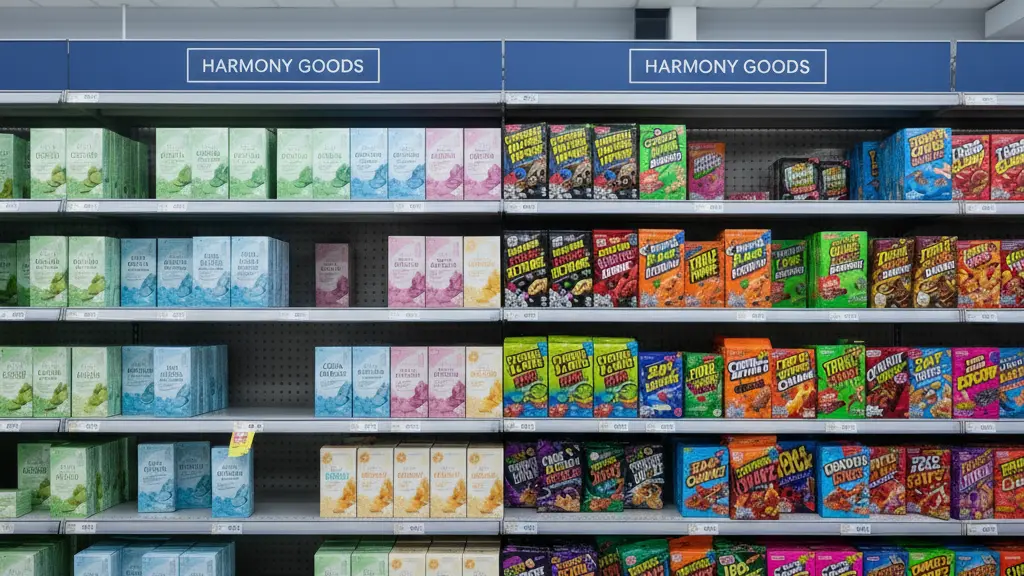
On shelf, shoppers don’t parse details first – they scan for shape, color block, brand mark, product type, and key claim. If those five signals aren’t obvious from a distance, the hand never reaches the pack. High-res renders and Instagram close-ups can mislead; what wins in a feed can underperform on a shelf.
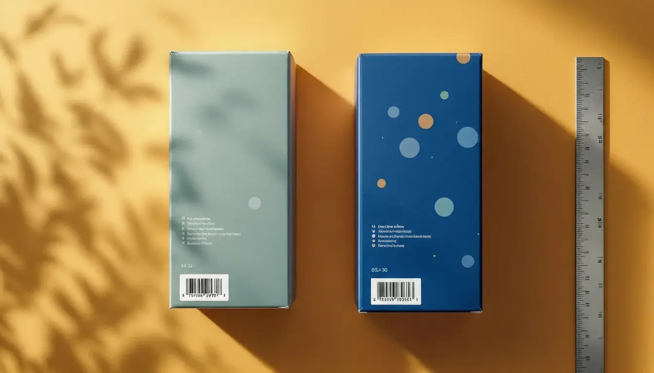
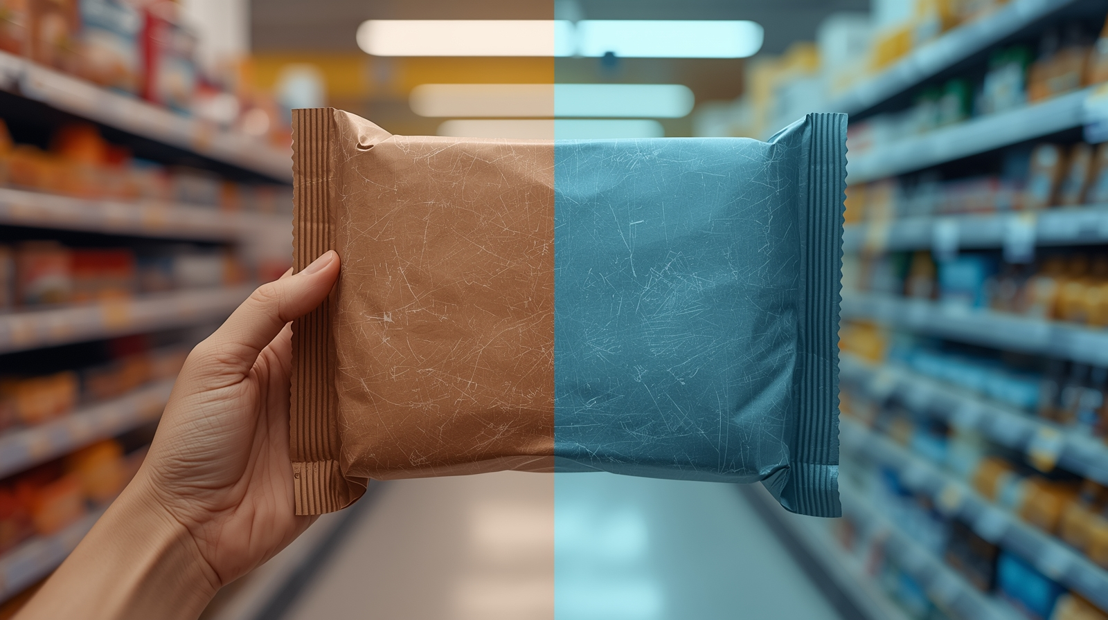
Color also shifts under retail LEDs and fluorescents – what looked rich in daylight can read dull or cold. If you’re printing on films or metallic boards, colors will change again unless you control white underprint and finishes. (If this is new, start here: CMYK vs RGB: why your colors look different in print and White Ink on Clear & Metallic: Build It Right, Proof It Once.)
The Practical Fix (Production-Savvy)
1) Build a distance-first hierarchy. Decide what a shopper should get in 3 seconds: Brand → Product Type → Variant → Key Proof (e.g., SPF 30, 0% sugar, vegan). Lock this sequence into your master layout. If the pack family is growing, anchor it with a consistent system – see Designing a packaging family: a simple SKU architecture.
2) Choose type sizes that survive reality. Your logo can be elegant; your product type must be legible. Use generous x-height fonts with sturdy strokes for far-reading lines. My approach to font choices is here: How I choose fonts for packaging. Then proof at actual size – print a quick A4 mockup, step back three meters, and check what you truly see.
3) Color block with purpose (and with proof). Create strong, simple color fields that separate brand and variant. Test under store lighting – LED “cool white” can drain warmth or push blues. If your substrate affects color (uncoated board, kraft, metallized film), plan builds that account for it; this primer helps: Materials & finishes that do the selling for you.
4) Keep the front clean – move the chatter. Front-of-pack earns space for only what drives the grab. Shift legal/long copy to side panels and keep the barcode in a safe, contrast-rich zone. If barcodes give you recurring headaches, read: Barcodes, legal & nutrition compliance – without killing your design. (Production guidance, not legal advice; confirm local rules and retailer requirements.)
5) Design to the dieline, not over it. Distance legibility dies when trim bites the heading or a curve swallows a word. Build with proper bleed and safe zones in a dieline that matches your converter – then export cleanly. Refresher here: Dielines & bleed: the simple guide to packaging that prints right the first time.
6) Make variants obvious, not noisy. Use one predictable zone for the variant name/color. Consistency makes shopping easier and families look stronger. When you’re moving fast across SKUs, templates help – Reprint-ready templates: cut prepress time by 30%.
7) Proof like it’s on shelf (because it will be). Contract proofs are great, but in-hand prototypes under store light tell you the truth about color, glare, and readability. For films/metallics, verify white underprint coverage so variant colors stay consistent with the rest of the line.
8) Capture the rules in a living brand book. Host your online brand book on your WordPress/Elementor site (your server), with a “Shelf Rules” page: minimum type sizes, color blocks, variant logic, and photo mockups at distance. Why this matters: Why your brand needs an online brand book. Keep assets downloadable so your team and vendors don’t improvise.
Short-Term Wins (This Week)
- Clearer shelf presence: shoppers get brand + product in one glance.
- Faster decisions: a simple hierarchy reduces internal debate.
- Fewer print surprises: dieline-safe layouts and substrate-aware color builds.
- Practical tools on day one: a distance test PDF and a brand book page your team actually uses.
Long-Term Wins (This Quarter/Year)
- Stronger recognition across sizes and formats – your line reads as a family.
- Less discounting: clarity helps conversion at full price.
- Smoother reprints and launches thanks to templates and documented shelf rules.
- Better multi-market packs: clear hierarchy leaves room for multilingual info without crowding – see Multilingual packaging: make clear HU/EN and beyond.
How I Handle This With Clients (Hungary + In-House)
We start with a distance audit: real-shelf photos, a quick legibility score at one and three meters, and a plan to rebalance hierarchy. I build a master layout (logo, product type, variant, key proof), align type sizes, and set color blocks tuned to your substrate. Then we run in-house prototypes and a fridge/lighting test where relevant.
Deliverables include press-ready files (with a 3-page PDF hand-off: Page 1 art+dieline overprint; Page 2 art-only; Page 3 diecut-only) and a “Shelf Rules” page in your online brand book (HU/EN, hosted on your server). If you value real-time collaboration without time-zone gymnastics, this explains the setup: Central Europe, real-time: why a Hungary-based designer makes life easier.
Final Thought
Shelf power is clarity plus restraint. When your pack says the right things from three meters away – and the rest in the hand – you win attention without shouting and convert without coupons.
Want a fast read on your pack
I’ll score your current design, prototype a distance-proof layout, and lock it into your brand book.