Same artwork, different result. Learn how stocks (paper/film) and finishes (varnish, lamination, foil, spot UV) change color, durability, and feel—so you spend wisely and look better longer.
Tiny white edges after cutting? That’s a bleed problem. This simple guide explains dielines, bleed, and safe zones—so your packaging prints right the first time.
Launch pulled forward? Claims changed at the last minute? With in‑house production, we tweak, proof on real stock, and deliver short‑run packaging and POS—so you hit the date without losing consistency.
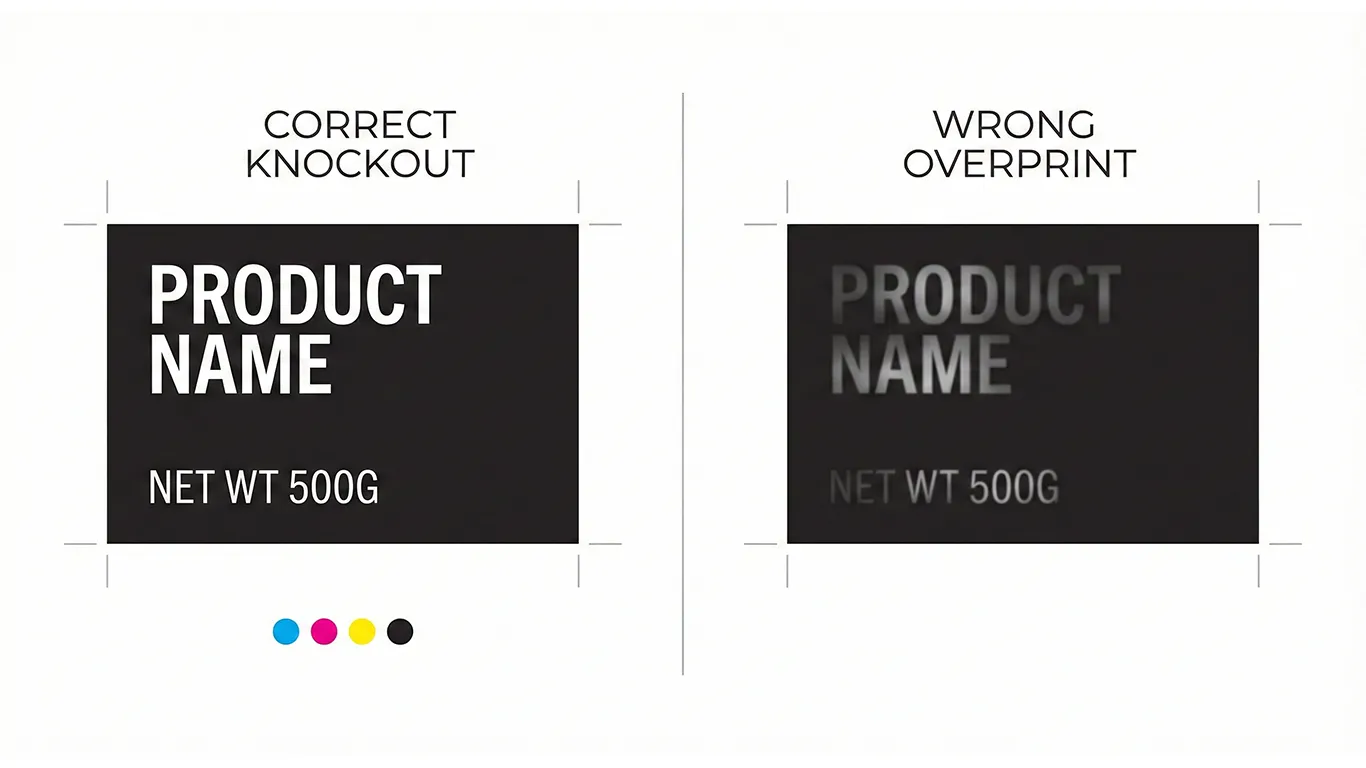
Tired of hunting files and fixing avoidable print mistakes? An online brand book (built in WordPress/Elementor, hosted on your server) gives you one link for logos, colors, dielines, and print specs—so you move faster today and scale smoothly tomorrow.
Latest Posts
Treating your packaging structure as a flexible draft during the design phase is a budget – killer. Learn why the Dieline Lockpoint is the single most critical milestone in your workflow, preventing expensive tooling changes, artwork cascades, and prepress delays. A 1mm shift costs more than you think.
Overprint and knockout are critical settings in print production that, if mismanaged, can lead to disastrous color mixing, disappearing text, and ultimately, a ruined brand appearance. Understanding the nuances of these settings, especially when dealing with brand colors and complex packaging designs, is essential to preventing costly reprints and maintaining brand integrity.
Sustainability is not a material you buy – it is a set of decisions you repeat. Here is a calm, production-savvy way to reduce waste and cost without greenwashing, from substrates and inks to proofs and reprints.