Treating your packaging structure as a flexible draft during the design phase is a budget - killer. Learn why the Dieline Lockpoint is the single most critical milestone in your workflow, preventing expensive tooling changes, artwork cascades, and prepress delays. A 1mm shift costs more than you think.
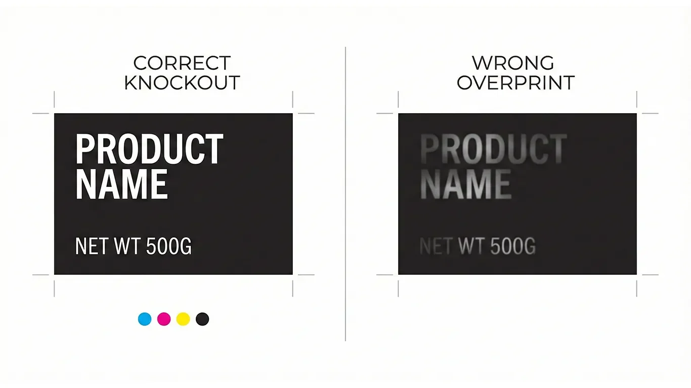
Overprint and knockout are critical settings in print production that, if mismanaged, can lead to disastrous color mixing, disappearing text, and ultimately, a ruined brand appearance. Understanding the nuances of these settings, especially when dealing with brand colors and complex packaging designs, is essential to preventing costly reprints and maintaining brand integrity.
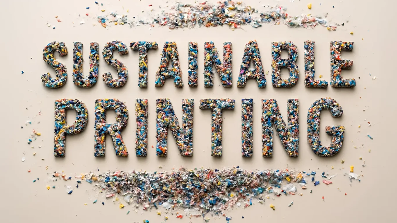
Sustainability is not a material you buy - it is a set of decisions you repeat. Here is a calm, production-savvy way to reduce waste and cost without greenwashing, from substrates and inks to proofs and reprints.
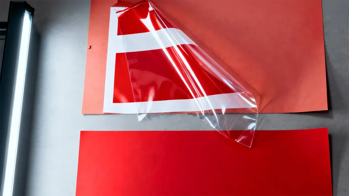
Color on shelf is a business decision. This guide shows how to keep brand color consistent across Pantone and CMYK, paper and film, and different vendors - without guesswork.


