10:03 a.m. Your printer replies with a list that makes your stomach drop: dieline is printing, barcode sits on a varnish pattern, white ink plate missing, two linked images not found, RGB profile embedded. All you changed was a new scent name – so why does it feel like the file needs surgery?
This is where file hygiene earns its keep. When overprint/knockout is set correctly, fonts behave, images are linked, and the export is clean, prepress stops sending mystery errors. You keep your timeline, and press day feels boring – in the best possible way.
What’s Really Going On
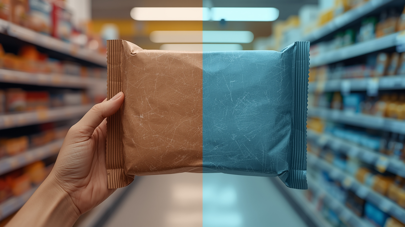
Packaging files are technical documents that happen to be beautiful. RIPs, plates, and cutters are literal: if the dieline is not flagged as a non-printing spot, it will print; if white ink is not set to overprint, you will knock holes in your color; if a barcode sits on a glossy texture, scanners struggle. Small slips multiply as files pass from designer to prepress to press.
The fix is not “work slower” – it is build a repeatable setup. A few simple habits turn every hand-off into something the press can trust.
The Practical Fix (Production-Savvy)
1) Overprint vs knockout – use them on purpose.
- Dielines: keep them as a spot color (e.g.,
DIE_LINE) set to Overprint, strokes only. They guide, not print. - White ink: create a dedicated spot (e.g.,
WHITE_UNDERPRINT), set to Overprint, and choke it about 0.15-0.25 mm to avoid white halos around color. - Black text/rules: small black elements can overprint safely; large black solids often should knock out to avoid muddy color.
- Spot varnish/foils: map as separate spot plates; confirm they do not overprint your barcode or legal microtype.
2) Fonts – outline what should never reflow, keep what should stay editable.
- Display/logotype → outline at export to prevent substitution.
- Body/legal → keep live with proper paragraph/character styles so edits do not break spacing.
- Package the fonts with the working file; in finals, they can remain embedded or outlined depending on your printer’s preference.
3) Links that do not go missing.
- Keep a
Links/folder inside each SKU package. - All placed images CMYK at 300 ppi (or press-profiled as required). Avoid hidden RGB that can shift on press.
- Re-link anything from cloud drives to local project paths before export.
4) Color that survives substrate.
- Define coated/uncoated CMYK builds for brand colors. Do not eyeball from screen.
- On films/metallics, plan your white underprint early so color reads true – windows remain transparent.
- If the basics on bleed and trims are rusty, here is a quick refresher: Dielines & bleed: the simple guide to packaging that prints right the first time.
5) Barcode and microtype sanity.
- Place codes on solid, matte areas with clean quiet zones.
- Minimum size respected – no varnish texture crossing the bars.
- Keep microtype above your printer’s legibility threshold (typically 5-6 pt on coated – test uncoated). (Production guidance, not legal advice; confirm local rules and retailer requirements.)
6) Layer logic that anyone can follow. Use a predictable stack, e.g.: 00_DIELINE (Spot Overprint) → 01_WHITE_UNDERPRINT → 02_ART → 03_WARNINGS → 04_BARCODES → 99_NOTES. Clear names save hours when vendors open your file.
7) Export that prepress will thank you for. Deliver a 3-page PDF every time:
- Page 1: art + dielines (dielines as spot strokes set to Overprint).
- Page 2: art-only (RIP-friendly; no dielines).
- Page 3: diecut-only (spot strokes for cut/crease/perf/glue). Include bleed, correct trim box, and a small slug note with stock, varnish, white-ink, and choke values.
8) Name, version, and park it where your team will find it.
- Human file names beat “final_FINAL”:
Brand_Product_Variant_Size_VER###_YYYYMMDD. - Store master files and exports on a shared server with a clear folder structure and a single owner/manager.
- If you create variants often, build reprint-ready templates so the technical zones stay locked while you change only the bits that should change – flavor, language, weight. For the full process, see Reprint-ready templates: cut prepress time by 30%.
Short-Term Wins (This Week)
- Cleaner approvals – no more “why is the dieline printing?” emails.
- Faster vendor quotes and fewer prepress change fees.
- Barcodes and microtype that pass QC the first time.
- Less rework – what you export is what the press expects.
Long-Term Wins (This Quarter/Year)
- Fewer reprints or credits because plates and varnish maps match the intent.
- Easier onboarding for new printers – files read like a manual, not a puzzle.
- Faster SKU extensions thanks to templates and consistent layer logic.
- A calmer team – fewer emergencies, more on-time launches.
Final Thought
Pretty files are easy; printable files are valuable. Nail overprint vs knockout, respect the layers, and export like you mean it. Your packaging – and your timeline – will thank you.