Five minutes before 5 p.m., your printer calls. There’s a tiny white hairline along the edge of your label. It’s not a color issue—it’s missing bleed. You can still make the deadline… if you fix the file, re-export, and re-send in the next 10 minutes.
That’s the difference a good dieline and proper bleed make: no end‑of‑day drama, just clean, predictable printing.
What a Dieline Really Is (and Isn’t)
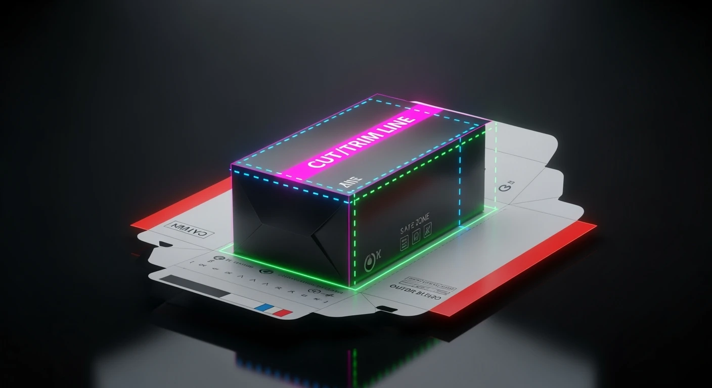
A dieline is the blueprint for your packaging. It shows where the sheet will be cut, folded, and sometimes glued. Think of it as the map every other design decision follows.
On a dieline, you’ll typically see:
- The trim/cut path (where the knife will cut)
- Crease/fold lines (where the board bends)
- Glue flaps and no‑print areas
- The bleed boundary (more on that next)
Designers often keep these guides as non‑printing spot‑color lines on their own layer, so the press operator can see them without accidentally putting them onto the final artwork.
Bleed: The 3 mm That Saves Your Day
Bleed is extra artwork that extends beyond the trim line. When the stack is cut, bleed ensures there’s no sliver of unprinted paper at the edge.
In the EU (including Hungary), a common spec is 3 mm bleed on all sides for boxes and labels; some jobs request 5 mm (large formats) or 1.5–2 mm (small labels). If your artwork stops exactly at the trim, any tiny cutting tolerance can reveal a white edge.
Rule of thumb: extend backgrounds, colors, and images right through the bleed area. But keep text and logos inside the safe zone – usually 3–5 mm inside the trim, and even more near folds or glue flaps.
Why Printers Care About Layers
Printers read files differently than screens do. They need to know what prints and what’s just guidance.
A tidy handoff usually includes:
- Artwork on normal CMYK (and any spot/Pantone) layers
- Dieline guides on a separate top layer, set to a non‑printing or clearly named spot color (e.g., “Dieline/Cut/Crease”)
- Special layers for white ink (on clear/metallic stock) or varnish/foil masks when needed
If in doubt, ask for your printer’s layer naming and export preferences—they’ll love you for it.
A Quick Story: Two Files, Two Outcomes
Same design. Two deliveries.
File A stops the background at the trim, text sits 1 mm from the edge, and the dieline is flattened into the artwork. The printer spots the risk, emails for a fix, and the job slips a day.
File B pushes color into a full 3 mm bleed, keeps copy 5 mm inside the trim and away from creases, and includes a clean non‑printing dieline. The file goes straight to plates. No drama. Same design—different prep.
Your 60‑Second Preflight (Before You Hit Send)
- Do backgrounds and images extend into the bleed?
- Is all text/logos inside the safe zone (3–5 mm from trim, more near folds)?
- Is the dieline on its own layer and non‑printing/clearly named?
- Are any special inks (white, varnish, foil) on their own spot‑color layers?
- Are images embedded/linked correctly and at suitable resolution for print?
- Did you export with bleed and include crop/trim marks if requested?
If you’re unsure about any of these, send a quick low‑res proof to your printer and ask for a thumbs‑up.
Short‑Term Wins (Why This Matters Today)
- Fewer last‑minute fixes and no hairline surprises
- Faster approvals because proofs match what hits the shelf
- Smoother quotes and timelines (your files look professional and complete)
Long‑Term Wins (Why This Matters Next Quarter)
- Reusable templates that make every new SKU faster and safer
- Consistent edge finishes across sizes and variants
- Happier printers → better relationships → fewer rush fees
Final Thought
Great packaging doesn’t just look good on a mockup. It survives the press. Mastering dielines and bleed is a small habit that protects your timeline, budget, and brand every single time you print.
Need a press‑ready dieline or a quick file health check? I’m happy to help set up reusable templates for your labels, boxes, and sleeves.
Addendum: My 3‑Page PDF Hand‑Off (Real‑World Workflow)
To speed RIP time, simplify separations, and keep diemaking clean, I deliver the same artwork in a 3‑page PDF:
Page 1 — Art + Dielines (visual QA). Quick check for folds, bleed, margins, panel logic. Construction lines are spot colors set to Overprint so they don’t knock out the art.
Page 2 — Art Only (RIP‑friendly). Only CMYK/spot artwork—no construction lines—so flattening and color separation run faster. Prepress doesn’t need to whitelist a dieline spot; there’s nothing extra to drop.
Page 3 — Diecut Only (for the diemaker). Clean diecut drawing with unique spot colors per function (Cut / Crease / Perf / Glue). All lines are strokes, not fills, which is essential for building the die‑board.
Why it works: faster prepress, cleaner separations, fewer back‑and‑forth emails, and diemakers get exactly what they need without clearing CMYK art first.
Extra Preflight Checks I Use
- Construction lines (cut/crease/perf/glue) are spot colors set to Overprint and strokes (not fills).
- PDF includes Page 1: art + dieline, Page 2: art only, Page 3: diecut only when the printer supports this workflow.


