Walk into a shop and imagine seeing your whole range together. The new flavor just arrived, there’s a smaller size for convenience stores, and a seasonal version is on promo. Do they look like one confident family—or distant cousins at a reunion? That gap is what SKU architecture closes.
Think of it as your house rules: a few simple decisions that make every new pack feel unmistakably yours, without re‑inventing the wheel each time.
The Three Questions Every Pack Must Answer (fast)
- Who are you? Your brand needs to be the first thing a returning customer spots.
- What is it? Say the product clearly (“sparkling water” beats a poetic name on its own).
- Which one? The variant (“Lemon”, “500 g”, “Mint 02”) should stand out on purpose.
If a stranger can answer those three in three seconds at two metres, you’re winning the shelf.
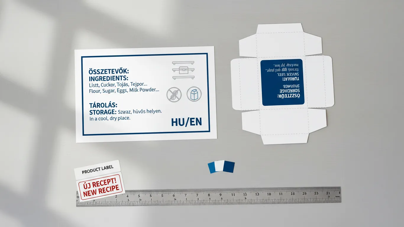
Make Variants Obvious (and printable)
- Choose a CMYK‑friendly palette that works on both coated and uncoated stocks. We’ll save two recipes per color in your brand book.
- Add a backup cue: a small icon (a lemon, a leaf), a number (01/02/03), or a two‑letter code. Helpful for color‑blind shoppers and tricky lighting.
- Keep contrast honest. Variant names shouldn’t sit on low‑contrast backgrounds.
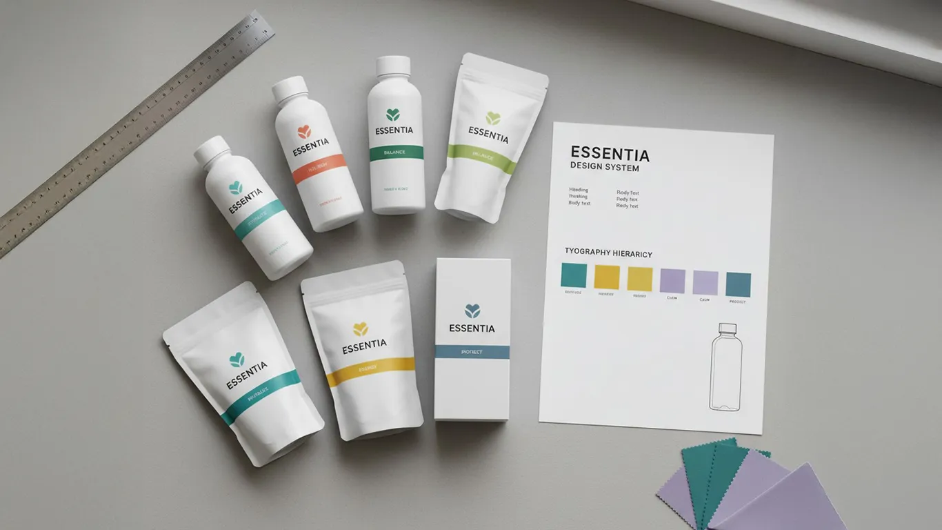
Same Family, Different Sizes
A tall can is not a short bottle, and a pouch is not a box—yet the family look should hold.
I build on a shared grid with locked zones (brand, product, variant, legal). Then we create a few size classes (small bottle, tall can, pouch front, carton side). Each class feels like you, with tiny layout tweaks so type isn’t squashed and claims don’t drift towards folds or glue flaps.
A quick “measuring‑tape test” keeps us honest: on the flat dieline we mark safe areas, then print small, wrap it, and check seams and creases.
Specials Without Chaos
Limited editions and promos are fun—until they break the system. The fix is simple:
Reserve a badge/band area for “Limited” or “New”.
Keep the core hierarchy the same; only the accent changes.
If you need a promo sleeve or sticker, let the base pack stay unchanged underneath.
The shelf still says “special”—but it still says you.
Print Reality (so it works off the screen)
We proof hero colors on the actual stock. Coated and uncoated need different ink builds; we save both.
Clear labels and metallized materials get a white underprint behind logos and small type.
Finishes change the look: matte softens, gloss sharpens. We choose once and document it.
All specs live in your online brand book (WordPress/Elementor, on your server) with downloadable swatches and dielines.
I’m based in Hungary, so we can run quick in‑house proofs and hand clean specs to your volume printer when you scale.
A Quick Story
A drinks brand added a sugar‑free variant and a 330 ml can. Before the system, each new pack needed a mini‑redesign and three email chains. We set a simple hierarchy, color logic (numbers + bands), and size classes. The next two variants dropped into the template, proofed once, and went to print without fuss. Same budget—just used smarter.
What You Gain
This month: faster launches, calmer approvals, fewer reprints. Buyers see a tidy line that feels retail‑ready.
This year: stronger shelf recognition, lower design time per SKU, easier multilingual/market versions.
Final Thought
SKU architecture doesn’t limit creativity—it protects it. You get room to play where it matters (photos, finishes, stories), while the system keeps every new pack unmistakably yours.
Want a variant system that pays for itself by the third launch? Let’s lock your rules and add them to your brand book.