Have you ever received a printed label or flyer and thought, “Wait… that’s not the color I approved”? It’s a common frustration—and one of the most misunderstood parts of working with printed materials.
The issue usually comes down to two things: RGB vs. CMYK. Let’s break it down.
What Are RGB and CMYK?
RGB and CMYK are two different color models used for different types of output:
- RGB stands for Red, Green, and Blue. It’s how screens (monitors, phones, TVs) display color—by mixing light. RGB can create very bright, saturated colors, especially neon tones and glowing blues or greens.
- CMYK stands for Cyan, Magenta, Yellow, and Key (black). This is the color system used in print—because printers apply ink to paper, not light to screens. CMYK can’t reproduce every RGB color, especially the really vibrant ones.
Why the Difference Matters
When you design something on a screen, you’re seeing it in RGB by default. But if that design is meant to be printed, it has to be converted to CMYK before it hits the press.
Here’s the catch: RGB and CMYK use different ways to create color.
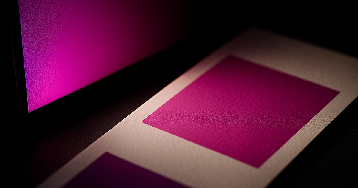
- RGB is light-based. Your screen emits red, green, and blue light directly. It can produce very bright, saturated, even glowing colors—because it’s projecting light straight into your eyes.
- CMYK is pigment-based. Ink on paper doesn’t emit light—it reflects it. The color you see depends on the ink, the paper, and the lighting around you. That’s why print colors are usually less intense than what you see on a screen.
This difference in how color is produced is a key reason why what you see on screen often doesn’t match what comes off the press. Especially with bright blues, purples, pinks, or neon tones—many of those can’t be recreated in CMYK.
This is also why monitor calibration matters. No matter how sharp or colorful your screen is, if it’s not showing colors accurately, you might approve a design that looks completely different in print. A design viewed on an over-saturated laptop in a dark room will look nothing like the same file printed on uncoated paper under daylight.
What Happens If You Design in RGB?
If your design is created entirely in RGB, then converted to CMYK just before printing, color shifts are almost guaranteed. This could lead to:
- Disconnected branding (your label doesn’t match your social media visuals)
- Misleading expectations for product packaging
- Costly reprints to fix the color
- Time wasted going back and forth with the printer
And usually, these problems show up at the worst time—right before print deadlines, when changes are most expensive.
How to Get Consistent Results
You don’t need to become a print technician to get good results—you just need to follow a few smart steps:
- Design in CMYK from the beginning if the final product will be printed.
- Ask for print proofs before full production—especially for packaging or large runs.
- Avoid “screen-only” colors—like neon or glowing hues—if you want a match in print.
- Calibrate your monitor if color accuracy really matters (or work with someone who does).
- Work with experienced designers and printers who understand how colors behave.
Final Thought
Color shifts between screen and print aren’t a mistake—they’re a natural result of using two very different technologies. But with a little awareness and the right setup, you can avoid surprises and make sure your brand always shows up looking its best.


