Overprint and knockout are critical settings in print production that, if mismanaged, can lead to disastrous color mixing, disappearing text, and ultimately, a ruined brand appearance. Understanding the nuances of these settings, especially when dealing with brand colors and complex packaging designs, is essential to preventing costly reprints and maintaining brand integrity.
Imagine this scenario: a client approves a packaging design with white text elegantly placed over a rich black background. The design files are sent to print, but when the final product rolls off the press, the white text has mysteriously disappeared, or worse, appears muddy and discolored. The culprit? A seemingly insignificant setting called “overprint,” and a lack of understanding of its counterpart, “knockout.” This seemingly small error can trigger a cascade of problems, costing valuable time, resources, and potentially damaging your brand’s reputation.
The Hidden Cost of ‘Small’ Mistakes: Overprint Explained
Overprint and knockout are fundamental concepts in print production that dictate how colors interact when printed on top of each other. Overprinting means that the colors will mix, while knockout (also known as ‘knockout’ or ‘reverse’) tells the printer to remove the underlying color, preventing any mixing. The impact of these choices is HUGE.
The cost lies in the invisible hours spent troubleshooting. When a design goes wrong at the printer due to incorrect overprint settings, it’s not just a simple fix. It involves prepress technicians identifying the problem, contacting the design team, waiting for revised files, and then rerunning proofs. This can easily add several hours, even days, to the production timeline. These delays can push back launch dates, impacting revenue and market share. Furthermore, the stress and frustration caused by these avoidable errors can damage client-designer-printer relationships.
Strategic Solutions: Mastering Overprint and Knockout for Brand Color Integrity
The solution lies in a proactive approach that combines technical expertise with clear communication. Designers must have a solid understanding of overprint and knockout settings and how they interact with different color combinations and printing processes. Equally important is a collaborative relationship with the printer, fostering open communication and early feedback to identify and address potential issues before they become costly problems.
When to Use Overprint (and When to Avoid It)
Overprinting is typically used for specific purposes, such as creating a rich black or trapping to prevent white gaps between colors. A “rich black” is typically created by overprinting cyan, magenta, and yellow inks underneath black, resulting in a deeper, more saturated black. Trapping is a technique used to compensate for slight misalignments during the printing process. By slightly overlapping adjacent colors, you can avoid unsightly white gaps that can occur if the plates are not perfectly aligned. However, overprinting should be avoided when printing light colors over dark colors, as this can lead to unwanted color mixing and a loss of vibrancy. For example, printing white text over a rich black background using overprint will result in the white disappearing or appearing muddy.
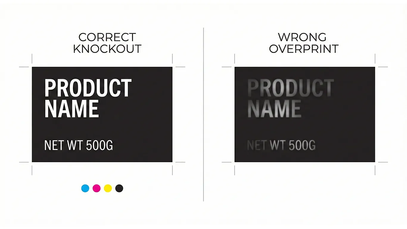
Avoiding the White Text Over Rich Black Catastrophe
The classic example of overprint gone wrong is white text over a rich black background. To ensure that the white text remains crisp and legible, it must be set to knockout. This tells the printer to remove the black ink from behind the white text, preventing any color mixing. In many design software programs, the default setting for text is often overprint, so it’s crucial to manually change this setting to knockout when dealing with light text over dark backgrounds. For more on setting up files correctly, see our post on Hygiene for Packaging: Overprint vs Knockout, Fonts, Links, and Exports That Presses Love.
Designer-Printer Communication on Trapping: Early Collaboration is Key
Trapping can be handled either by the designer or the printer, but clear communication is essential. If the designer is responsible for trapping, they must have a thorough understanding of the printing process and the specific requirements of the project. It’s crucial to discuss trapping strategies with the printer early on to ensure that the final result meets expectations. If the printer is responsible for trapping, the designer must provide clear and accurate files, including dielines and color specifications. Consider the color management principles outlined in our blog post about Color Consistency on Shelf: Pantone vs CMYK, Coated vs Uncoated, and White Underprint.
For file hand-off, preparing a 3-page PDF is often best practice: Page 1 shows the art and dielines with overprint settings; Page 2 includes art only; and Page 3 displays only the diecut.
Quantifying the Benefits: Linking Workflow to Financial Outcomes
Implementing a robust system for managing overprint and knockout settings translates directly into tangible financial benefits. By preventing misprints and reducing the need for rework, you can save valuable time and resources, improve efficiency, and protect your brand’s reputation. A failure in print quality means hours of work to fix, remanufacture, and reship.
- Cost Benefit: Reduction in prepress hours. A well-defined workflow reduces errors and saves at least 3-5 hours per project in prepress corrections.
- Quality Benefit: Improved color accuracy and consistency, leading to fewer reprints and higher customer satisfaction. You can save on transportation and material costs.
Ethical note: production guidance, not legal advice. Confirm local regulations and retailer requirements.
Final Thought
Mastering overprint and knockout is not just about technical proficiency; it’s about taking a strategic approach to print production. By understanding the nuances of these settings and fostering open communication between designers and printers, you can avoid costly mistakes, protect your brand’s integrity, and achieve superior results. Getting the print right the first time is both a quality imperative and an excellent cost-saving business decision.
Assess your current design templates to ensure overprint settings are correct and proactively prevent future errors.