The $100k Color Drift: Why Your Perfect PDF is a Production Hazard
8:36 a.m. The first production samples hit your studio desk. The red felt bold on the screen. The teal looked fresh. The neutral kept things grounded. Three SKUs – one cohesive family, right?
Then, you take them to the retail environment.
Under store LEDs, the red turns a shade too warm. The teal goes flat. The whole product family stops reading as one – it’s a collection of near-misses. Nobody “blew it” – you just signed off on the wrong base. The result is a $100,000 reprint looming, all because of an avoidable color drift.
Stable color isn’t a creative whim; it’s an operational spec that protects your brand, your budget, and your reputation. It’s the silent battle between your perfect design file and the chaotic reality of production.
What’s Really Going On: The Four Invisible Color Assassins
1. The Ink Method Showdown: Pantone vs. CMYK
Spot inks are your brand anchors – the stripes, the marks, the iconic hue that must be perfect. CMYK is the workhorse for photography and gradients, flexible and cost-effective. The trap? Expecting a single CMYK build to behave across every substrate, or a Pantone chip on coated stock to magically match its uncoated or film twin. You must plan for the disconnect.
(If you’re still mastering the fundamentals, start with: CMYK vs RGB: Why Your Colors Look Different in Print).
2. The Substrate’s Agenda: Paper and Film Fight Back
The material under the ink is a color choice.
- Coated: Reflects light, holds ink crisp and sharp, resulting in colors that read cleaner and a touch cooler.
- Uncoated: Absorbs ink like a sponge, immediately warming and softening your hues – the $10k difference.
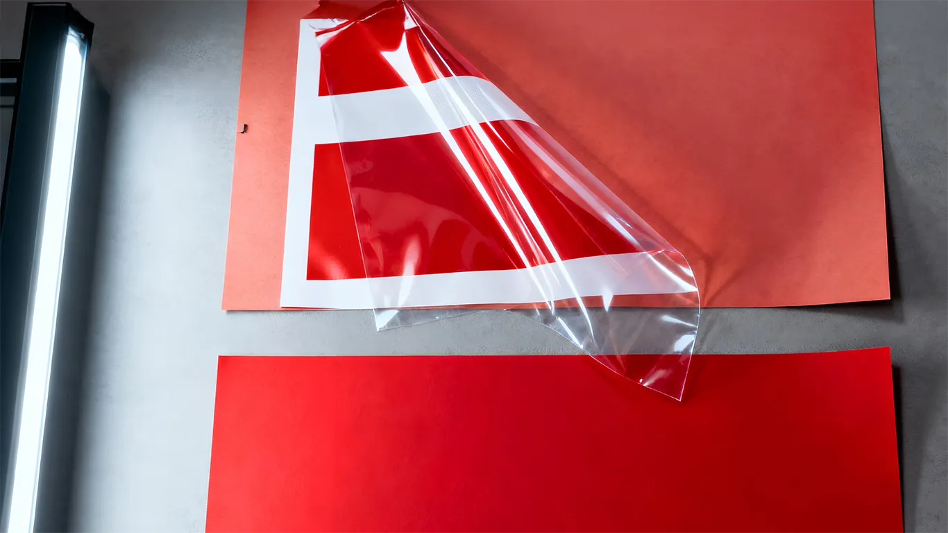
- Clear and Metallized Films: These are not paper. Without a controlled layer of WHITE_UNDERPRINT, you are merely tinting glass or metal, which fundamentally shifts the hue, saturation, and contrast. (Dive deeper into this critical detail: White Ink on Clear Metallic: Build it Right, Proof it Once).
3. The Finish Factor: Gloss vs. Matte
The final finish changes everything the shopper sees. A gloss varnish can add high glare and drop the perceived saturation. A matte finish can deepen the color but can also lower contrast. Even the smallest finish tweak around a color block alters the perception a shopper gets from three meters away. (Learn to use materials strategically: Materials Finishes That Do The Selling For You – Without Blowing The Budget).
4. The Lighting Lie: Approving in the Wrong Aisle
Approving a proof under only north light or D50 is a massive risk if your product sells under yellow-spectrum store LEDs. The lighting in the aisle has a completely different spectral curve. What looked vibrant by the window can land dead flat on the shelf. You must proof in the environment where you sell. (Master the light challenge here: Daylight vs Store Light: Why Proofs Shift and How to Lock Your Color).
🛠️ The Designer’s Practical Fix: Mastering Production-Savvy Color
Shift your mindset from “just designing” to “engineering the shelf presence.” (Focus on the final result: Shelf Power: Design for Distance, Win the 3-Second Read).
- Anchor What Can’t Drift: If brand recognition rides on a core stripe or mark, run it as a spot color. Document the specific ink name and tolerance. Use CMYK for everything else, but ditch the “universal build.” Create honest, separate builds for coated and uncoated stock.
- Insist on Real-Material Drawdowns: A short, inexpensive press check on the actual substrate beats a perfect, yet misleading, PDF every time. For film/metal, preview the behavior by adding WHITE_UNDERPRINT at 100% for true color and 0% for transparent windows.
- Intention-Driven CMYK Conversion: If converting a spot color is unavoidable, make two versions – Coated and Uncoated – and label them explicitly. Never rely on default library conversions.
- Normalize Finishes Around Critical Color: Protect color-critical areas by keeping them matte, or dropping a matte window inside a glossy panel. On scuff-prone uncoated boards, use a matte or satin overprint varnish for protection without glare.
- Approve Under Aisle Lighting: Review your contract proof or short run under the exact LEDs your retailer uses. For refrigerated products, do a five-minute fridge test to check for condensation-related color shifts.
The Long-Term Win: From Designer to Budget Protector
When you lock the cross-vendor rules once, you do more than just stabilize color – you stabilize the business.
| Strategy | Result |
|---|---|
| Align method, material, and light up front. | 30% Reduction in Material Costs (fewer reprints and scrap). |
| Standardize color specs globally. | 32% Savings in Transportation Costs (fewer air-freighted fixes). |
| Stabilize color near legal/claim blocks. | Cuts relabeling loops that quietly burn 1.3%–3.3% of your Wage Bill. |
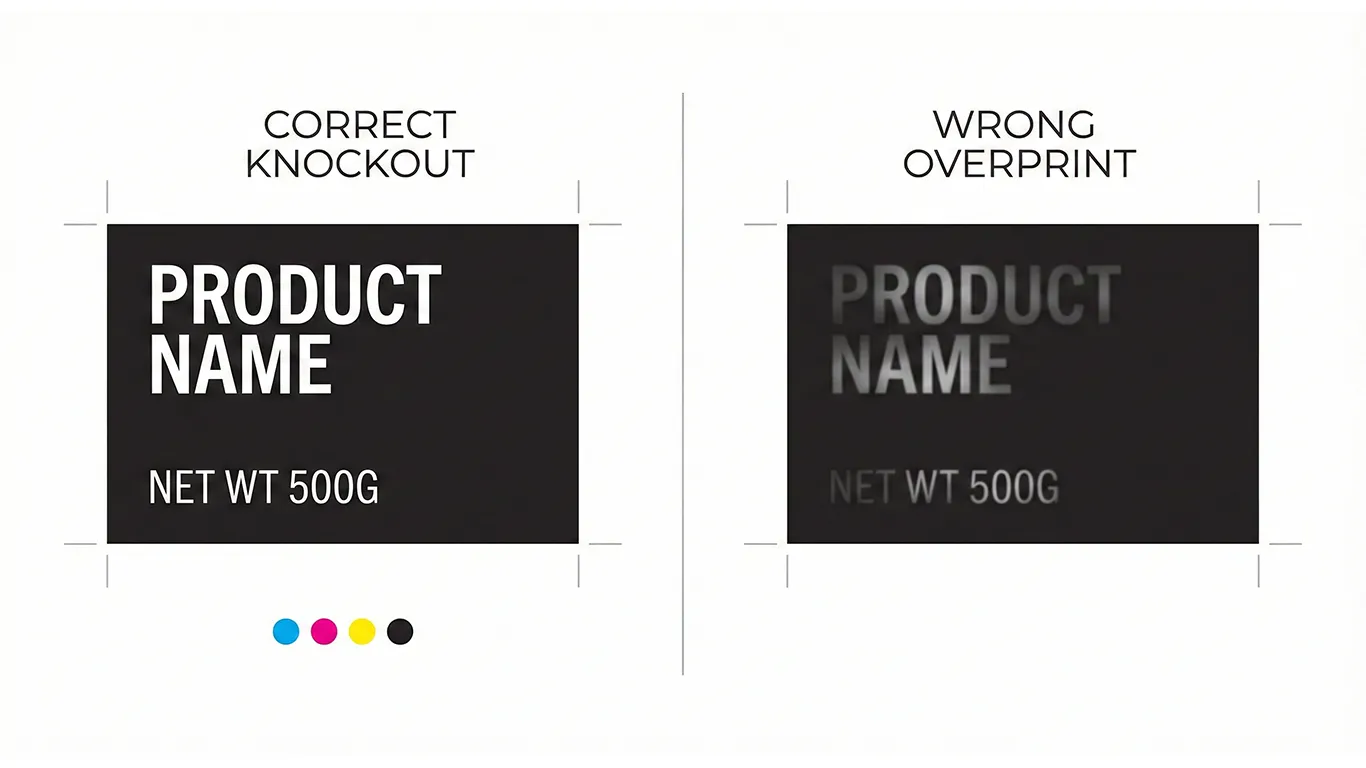
The Takeaway: Color is an operational spec, not just a creative call. By mastering these production rules, you protect budget, time, and reputation across every vendor and border. (When fixes are needed, refer to: Over-Label or Full Reprint: The Calm, Cost-Smart Way to Fix Packaging).
Final Thought: Color is a Promise
Keep that promise by choosing the right method, respecting the material under the ink, and approving in the light where the product actually sells. Lock those decisions once, document them clearly, and your family of products will stand together on the shelf, week after week. (To learn how to deliver perfect files, see: File Hygiene for Packaging: Overprint vs Knockout…).