8:11 a.m. A store manager texts a video. The cashier tilts the pack, waves it again, then types the price by hand. The line slows. Nobody set out to break the barcode – contrast, varnish, and a tight curve did it together. The fix is not louder graphics. It is a few print and layout choices that make scanners happy every time.
What’s Really Going On
Scanners do simple math: dark bars vs light spaces, in the right proportions. Low contrast, ink spread, glare, or distortion on a curve will trip that math. Substrate sheen, varnish choice, magnification, and the quiet space around the code are small decisions that have big consequences at checkout.
The Practical Fix (Production-Savvy)
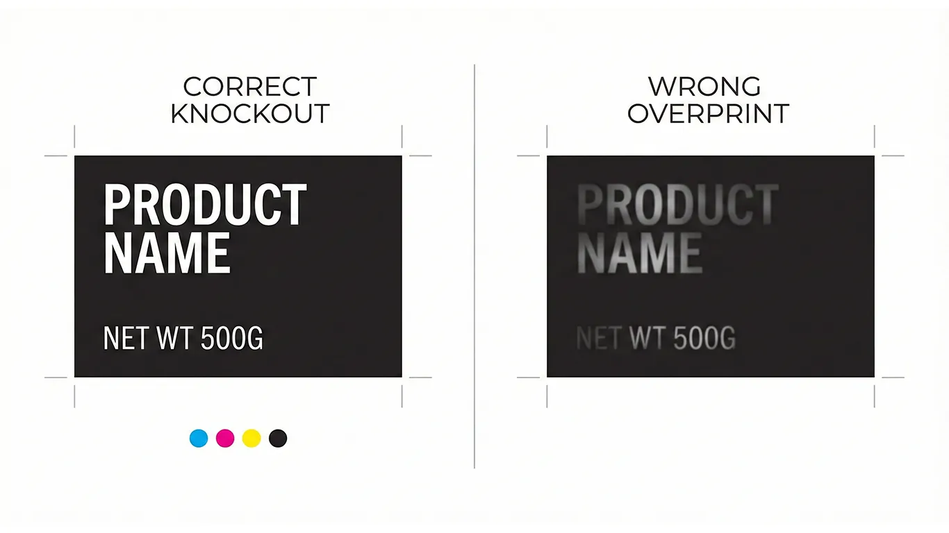
1) Park it on a calm, matte panel. Use a light solid background with 100% black bars (K-only). Avoid images, patterns, or micro-type underneath. If your layout is busy, create a dedicated barcode panel.
2) Protect the quiet zones. Leave clear space to the left and right of the code – no rules, folds, or graphics. Add thin non-printing guides in your template so nobody encroaches by accident.
3) Size with honesty. Do not miniaturize. Choose an honest magnification so narrow bars do not fill in. On flexo or offset, apply a small bar width reduction so press gain does not close the gaps. Digital tends to be cleaner – test anyway.
4) Kill glare where it matters. Gloss floods reflect the scanner’s light. Either keep the barcode area matte or leave a matte varnish window inside a gloss finish. Satin or soft-touch often balances protection with readability.
5) Curved and squeezable packs. Keep codes away from tight arcs, seams, or strong tapers. On round bottles, picket fence orientation usually scans better than ladder. Apply labels to filled product for tests – curvature changes when the pack is full.
6) Clear film and metallized stock. These substrates shift contrast. Add a WHITE_UNDERPRINT beneath the barcode panel so the scanner sees a paper-like base. Leave windows at 0% white where you want transparency.
7) Placement that survives converting. Avoid tuck edges, perforations, glue areas, and panel splits. Keep enough distance from die cuts so small registration drift does not clip the code or its quiet zones.
8) Proof like a realist. Print at actual size and scan under retail LEDs. Check straight on and at a slight angle both ways. If you change substrate, varnish, supplier, or magnification, re-check. For more on light conditions, this helps: Daylight vs Store Light.
9) Template it so nobody guesses. Bake a barcode panel and quiet-zone guides into your packaging templates. Hand off with a predictable export rhythm: Page 1 – art plus dielines as spot strokes set to Overprint; Page 2 – art-only for the RIP; Page 3 – diecut-only for cut or crease or perf or glue. For broader compliance context, see Barcodes, legal & nutrition.
Short-Term Wins (This Week)
- Immediate scan reliability with a matte panel, honest size, and clean quiet zones.
- Fewer emergency reprints – glare and ink-gain surprises are handled up front.
- Faster line time – pick-and-pack and checkout stop babysitting bad codes.
Long-Term Wins (This Quarter/Year)
- Lower operational friction – fewer credits, returns, and unhappy retail partners.
- Reusable templates – consistent barcode behavior across SKUs and substrates.
- Confidence to scale – new formats and vendors plug into a known rule set.
Ethical note: production guidance, not legal advice. Confirm local regulations and retailer requirements.
Final Thought
Barcodes are quiet until they are not. Give them a calm matte home with breathing room, test them where they actually live, and lock the method into your templates. The line moves, the cashier smiles, and your brand stays invisible in the best way.
Need a quick barcode review – I can check panels, finishes, and placement and return a simple spec your team can ship.