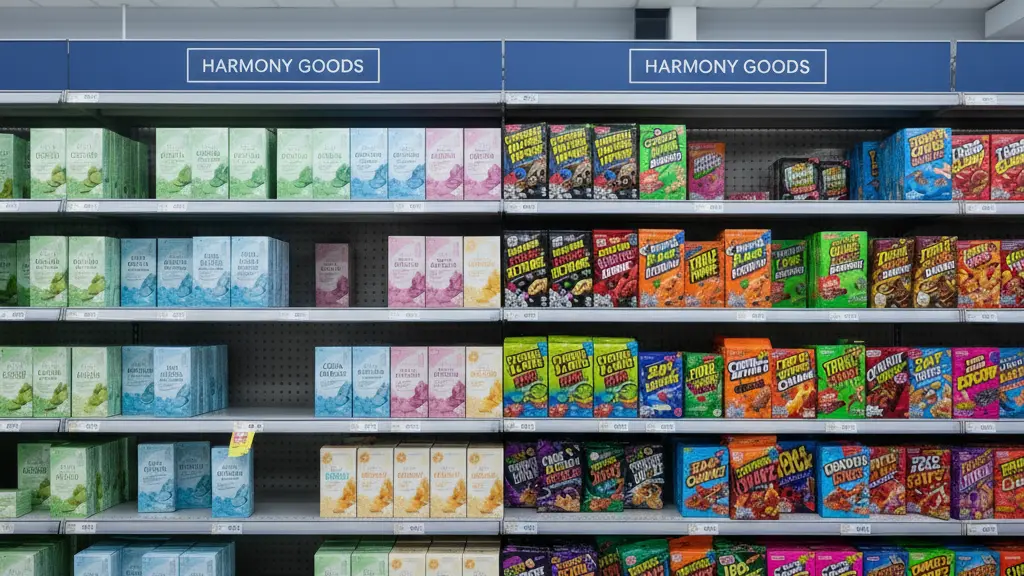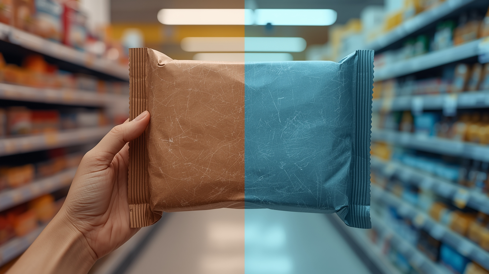
It’s 10:06 a.m. You’re holding a beautiful contract proof by the window—rich red, clean cream, perfect. Later, you drop the same proof in a supermarket aisle and it suddenly looks colder, a touch grey. The brand lead wonders if the printer slipped. The truth is simpler: light changed, so color changed. Unless we plan for store light, the shelf will keep moving the goalposts.
Good news—this is fixable. With a realistic build, a clear proof routine, and one quick real-world test, you can approve color that still reads right under retail LEDs.
What’s Really Going On
Color is a three-way handshake between ink, material, and light. Daylight (D50) is warm and balanced; most stores use cooler LEDs or fluorescents. Uncoated board absorbs ink; coated reflects more; films and metallics add their own cast. That’s why a red that sings on coated SBS can look tired on kraft, and why clear labels or metallized cartons need extra planning.
If you’re new to the print side of color, here’s a helpful primer: CMYK vs RGB: why your colors look different in print.
The Practical Fix (Production-Savvy)
1) Approve for the shelf, not just the studio. Ask for proofs you can check under two lights: D50 (daylight) and retail LED. The goal isn’t to match them perfectly—it’s to confirm the color still reads as your brand in both.
2) Choose materials with eyes wide open. Substrates shift color. Uncoated softens and warms; coated stays punchy; kraft pushes neutrals; films/metallics can chrome your hues. Decide the look first, then build color to that reality.
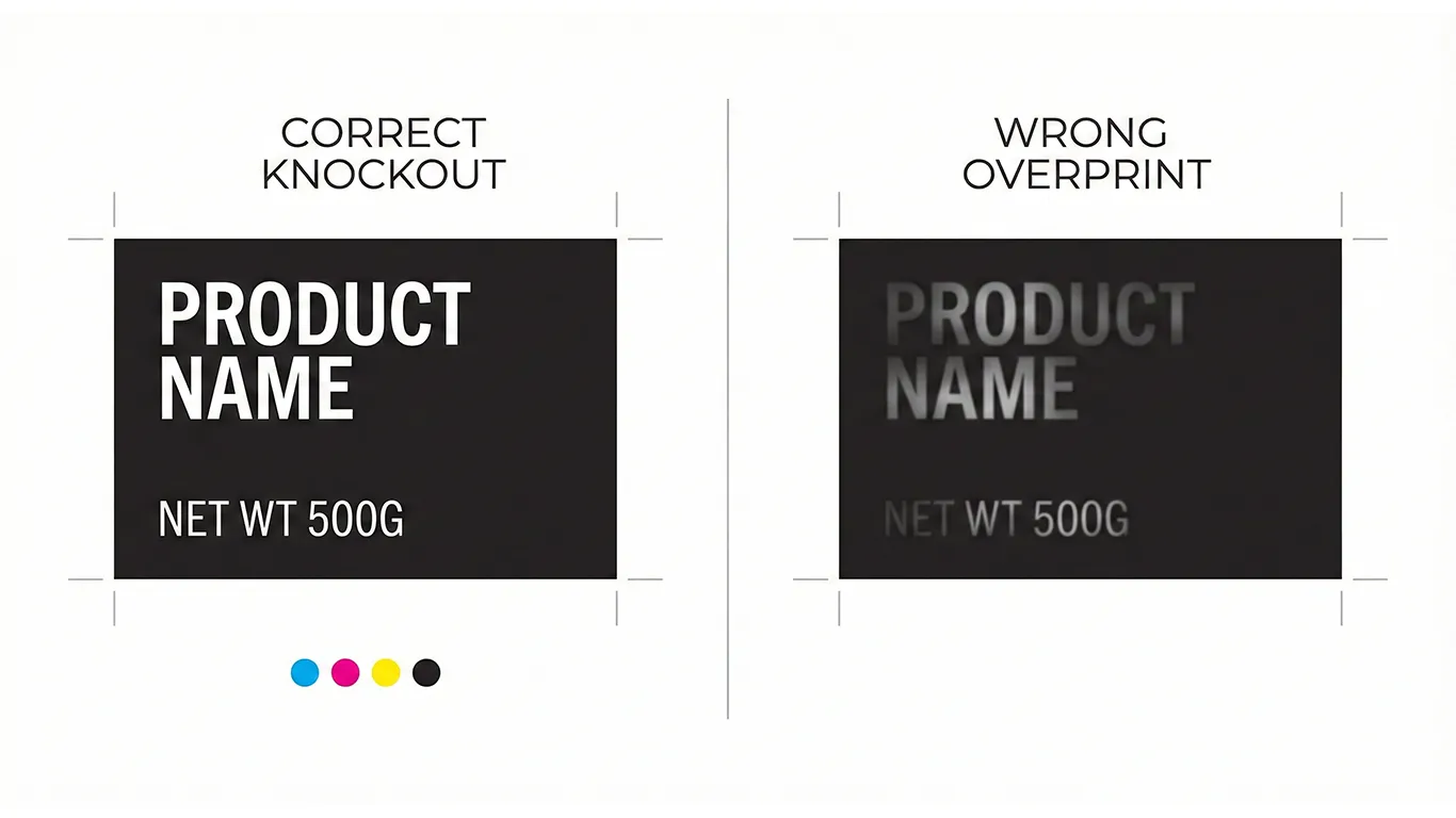
3) Control the base (white). On clear or metallic packaging, CMYK inks are translucent. Use a planned white underprint where you want true brand color, and keep windows clear where you want transparency.
4) Build honest targets—coated and uncoated. Print drawdowns of your brand colors on the actual materials you’ll run. Label them, keep them, and treat them as your reference—not the screen.
5) Run a quick “store test.” Before sign-off, place an in-house prototype under cool retail LEDs (and in the fridge/freezer if relevant). Step back three meters. Can you still read brand, product, key claim cleanly? If not, adjust now, not after 5,000 units.
6) Keep the hand-off clean. When files travel, color risk grows. Deliver a 3-page PDF so prepress doesn’t guess:
- Page 1: art + dielines (dielines as spot strokes set to Overprint).
- Page 2: art-only (RIP-friendly, no dielines).
- Page 3: diecut-only (spot strokes for cut/crease/perf/glue). If the mechanics of setup/bleed are fuzzy for your team, this refresher helps: Dielines & bleed: the simple guide to packaging that prints right the first time.
7) Capture the rules where everyone will find them. Add a “Color & Lighting” page to your online brand book (WordPress/Elementor on your server). Store targets, viewing tips, and a short checklist so marketing, purchasing, and printers follow the same playbook.
(Ethical note: This is production guidance, not legal advice; confirm local regulations and retailer requirements before release.)
Short-Term Wins (This Week)
- Approvals that hold up under store LEDs, not just sunlight.
- Fewer “it looked different in the aisle” debates at sign-off.
- Drawdowns on real materials become your truth source, not a lucky guess.
- Calmer vendor conversations: clean files, clear targets, fewer surprises on press.
Long-Term Wins (This Quarter/Year)
- Consistent color across substrates and print vendors—less drift, more trust.
- A repeatable proofing routine your team can run without meetings.
- Faster launches: new SKUs inherit known builds and targets.
- Less discounting on shelf because the pack reads strong in real light.
How I Handle This With Clients (Hungary + In-House)
We begin with a color audit: the materials you use, the lighting your product lives under, and where color is slipping now. I create coated/uncoated builds, plan white ink if films or metallics are involved, and run in-house prototypes to test under store LEDs (and cold-chain conditions where needed).
You get a clean 3-page PDF hand-off for each SKU and a “Color & Lighting” page added to your online brand book (HU/EN, hosted on your server) with downloadable drawdowns and viewing guidance. Hungary-based means you get same-day answers, and if a printer calls, I’m on with them in your workday.
Final Thought
Color is a promise. Approve it under the light your customer will actually see, and that promise holds—from studio to shelf.