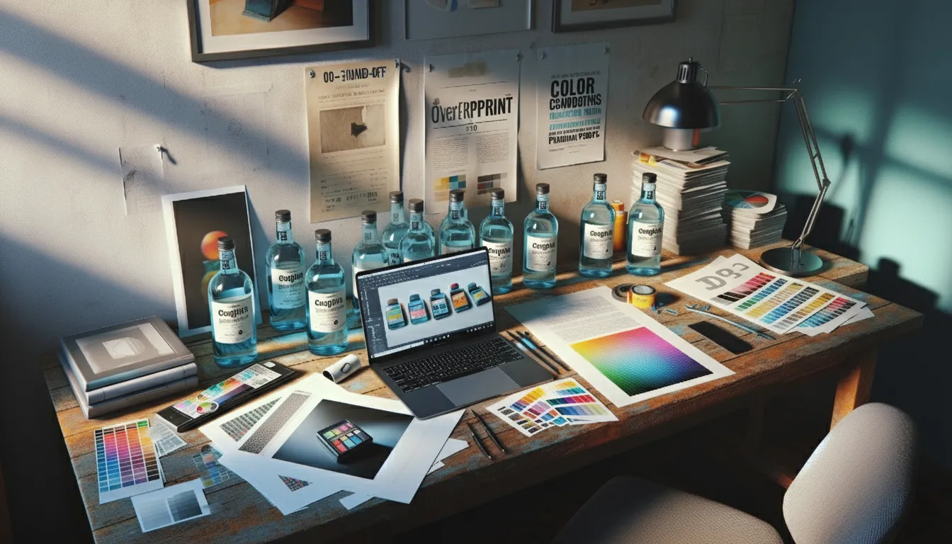
A cosmetics startup pings me at 09:12: “We only changed the fragrance name—why did the printer send a list of issues?” Missing fonts. Linked images gone. New barcode in a low-contrast zone. The dieline is “v7_final_FINAL”. Launch slides by Friday. Sound familiar?
Here’s the thing: variant work shouldn’t feel like a fresh mountain every time. When your packaging lives inside a proper template system, small changes stay small – and press day stops being a gamble.
What’s Really Going On
Most delays don’t come from design taste—they come from file hygiene. Every time a variant is made from last month’s folder or an old supplier dieline, you inherit hidden problems: overprint set where it shouldn’t be, RGB images inside a CMYK job, soft edges around a white underprint, barcodes nudged too close to a varnish edge. Multiply that by 6 SKUs and two printers, and you’ve built a delay machine.
Templates switch the logic: instead of “fixing files each time,” you change only the parts that should change—text, flavor color, weight, language—while the technical bones stay locked.
The Practical Fix (Production-Savvy)
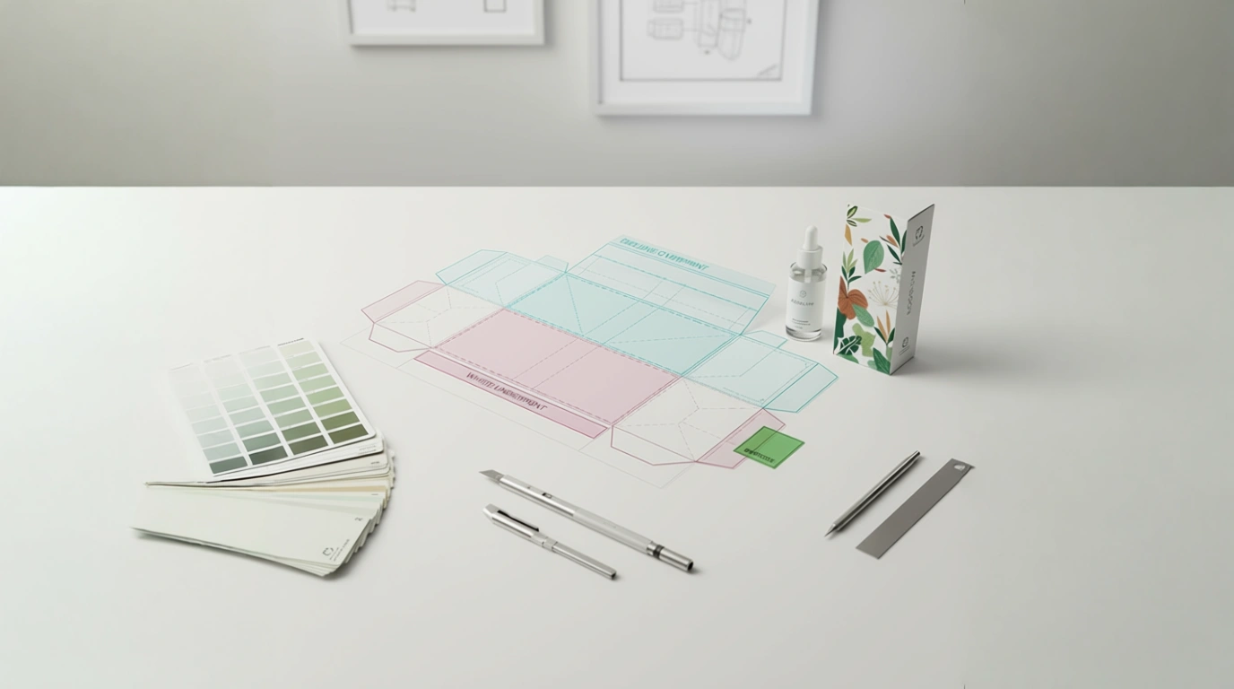
1) Build one “SKU frame” per format.
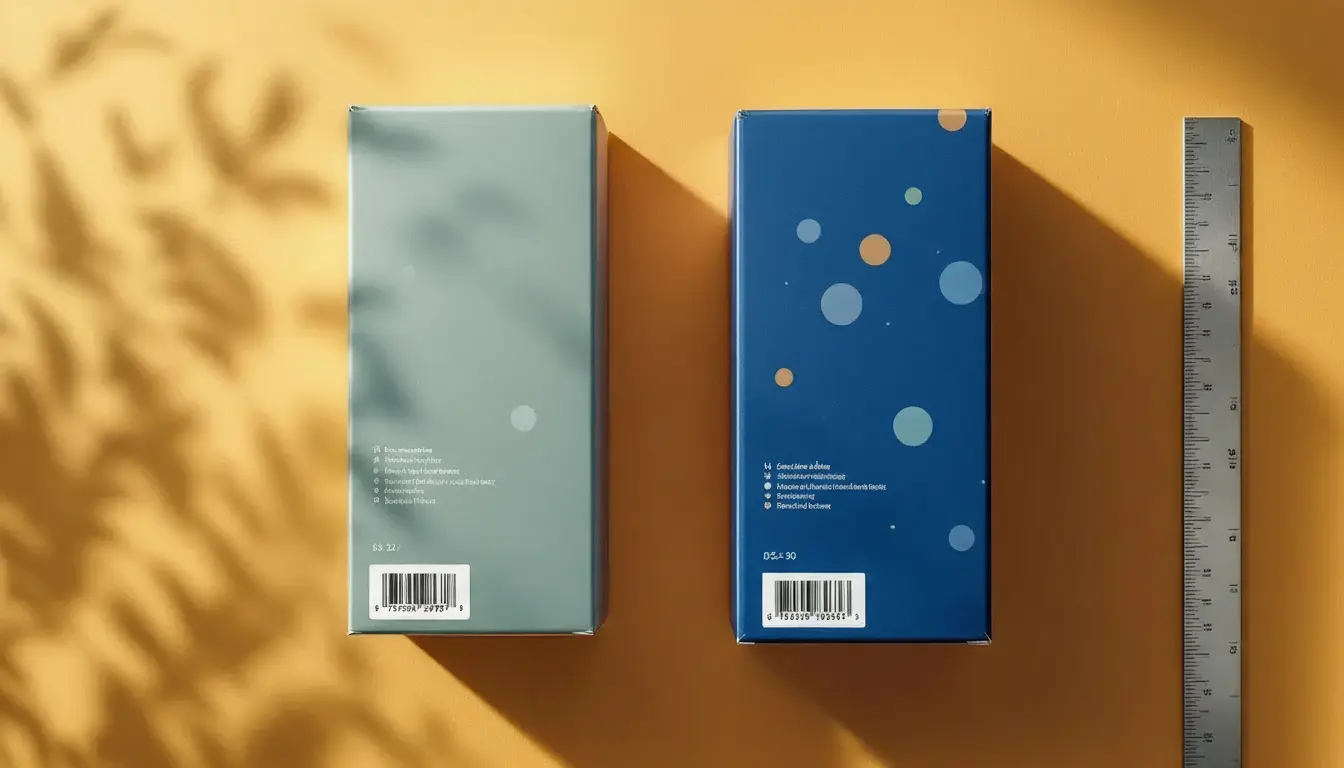
- Locked zones: brand mark, legal blocks, nutrition/compliance boxes, barcode area (with quiet zone), claims icons, mandatory marks.
- Variant fields: flavor/name, color swatch, net weight/volume, batch/lot placeholders, language lines (HU/EN + third if needed).
- Layers:
00_DIELINE (Spot Overprint),01_WHITE_UNDERPRINT,02_ART,03_WARNINGS,04_BARCODES,99_NOTES. Clear names save hours.
2) Color that survives the real world.
- Define CMYK builds for coated/uncoated inside the brand book, plus any spot/Pantone exceptions.
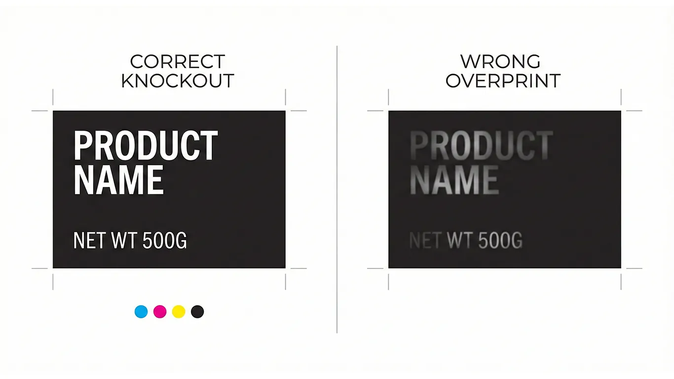
- If using clear film or metallized stock, create a dedicated WHITE_UNDERPRINT spot (100% swatch, set to Overprint) and choke it ~0.15–0.25 mm to avoid halos.
- Keep barcodes on solid white, matte or unvarnished if possible for scan reliability. (Production guidance, not legal advice; confirm local rules/retailer specs.)
- If you’re working on clear labels or metallic board, pair this with our step-by-step guide: White Ink on Clear & Metallic: Build It Right, Proof It Once.
3) Typography that never goes missing.
- Outline display fonts in final exports; keep live system/brand text styles in working files.
- Save paragraph/character styles:
H1_Product,H2_Variant,Body_Info,Micro_Legal. No style = no consistency.
4) Pictures and icons that behave.
- Place linked images in a
Linksfolder inside each SKU package; uncheck “Include On Save” bloat. - Use 300 ppi CMYK images for print; avoid hidden RGB profiles sneaking in.
- Keep vector icons mono where possible—cheaper, cleaner, and scale-proof.
5) Barcodes that scan.
- Size and contrast from the template, not the designer’s memory: quiet zones baked-in, no varnish textures crossing the code, minimum size respected. (Production guidance, not legal advice; confirm local rules.)
6) Exports your printer will love. Deliver the 3-page PDF hand-off every time:
- Page 1: art + dielines (dielines as spot strokes set to Overprint).
- Page 2: art-only (RIP-friendly—no dielines).
- Page 3: diecut-only (spot strokes for cut/crease/perf/glue). Bleed included, trim correct, output intent documented in the slug area (stock, varnish map, white ink note, choke/trap values).
7) Make the brand book do the heavy lifting. Your WordPress/Elementor online brand book (hosted on your server) gets a “Templates” page:
- Master files for each format (carton/label/flow-wrap, etc.).
- Coated/uncoated color builds, barcode specs, white ink do/don’ts.
- Export presets + a 60-second video showing the 3-page PDF hand-off. One owner/manager keeps it tidy; no forms, no changelog maze.
8) Train your team once, not every Tuesday. A 30-minute walkthrough: where variant fields live, how to swap language layers, where not to touch. After that, variants move in minutes, not days.
Short-Term Wins (This Week)
- Variant changes stop breaking layouts; you edit text/color, not structure.
- Fewer prepress emails: no missing fonts, no RGB surprises, no mystery dielines.
- Faster quotes/approvals: printers see the same clean 3-page package each time.
- Barcodes and compliance blocks stop drifting—less “please move 2 mm” back-and-forth.
- Predictable color on both coated and uncoated stocks.
Long-Term Wins (This Quarter/Year)
- ~30% less prepress time on average for each new SKU or reprint.
- Lower risk of reprints/credits thanks to locked technical zones.
- Easier vendor backup—any competent printer can run your files.
- SKU expansion without chaos; families stay consistent from three meters away.
- A calm team: less rescuing, more releasing.
How I Handle This With Clients (Hungary + In-House)
We start with a template audit: I review your current SKUs, printer notes, and recurring “gotchas.” Then I build master templates per format with locked zones, variant fields, and brand styles. We run in-house prototypes (carton dummies, clear-label tests, drawdowns) so you can approve with real light and real hands.
Everything lands in your WordPress/Elementor brand book on your own server—downloadable masters, color pages, barcode guidance, export presets—HU/EN so marketing and purchasing read the same playbook. Hungary-based means you get same-day answers, and if a printer calls, I’m on with them in your workday.
Final Thought
Templates aren’t red tape—they’re speed. Lock the technical bones once, and every variant after that becomes a light lift that prints right the first time.
Want the system?
Book a Template Setup & Preflight
I’ll convert one SKU into a reusable master and ship your 3-page PDF hand-off this week.