The export deal lands. Great news—until you look at your label and realize everything now has to appear in Hungarian and English (and maybe one more language soon). The pack is small. The legal text is long. The buyer wants it next month. How do you keep it readable, compliant, and still on-brand?
Here’s a simple, human guide to making multilingual packaging that customers can actually use—and printers can actually print.
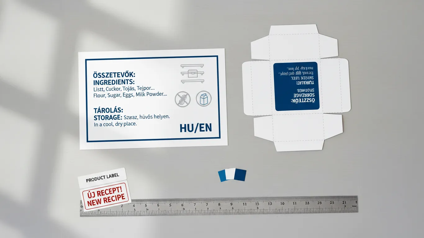
What really needs translation
You don’t have to translate every noun on the pack. Focus on the pieces that affect safety, choice, and compliance:- Product name & variant (what it is / which one it is)
- Claims (the promises you’re allowed to make)
- Ingredients / INCI and allergens (with clear emphasis)
- Usage & storage instructions
- Warnings / legal lines and distributor info
- Net content (g, ml) and any mandatory symbols
- Nutrition table (where applicable)
Barcode note: typically the GTIN for a SKU stays the same across languages unless you create a new SKU. Don’t change codes unless your product/pack changes in a way your system requires it.
Layout models that work (pros & cons)
There isn’t one “best” model—pick the one your pack size and category can support.1) Two-panel split (front/back or side/back)
- How it looks: HU front/primary; EN on the secondary panel—or vice versa.
- Why it works: The main selling side stays clean. Detailed info lives on the other panel.
- Watchouts: Make sure any mandatory front-panel items appear in both languages if required by your market.
2) Stacked blocks (A then B, same order)
- How it looks: HU block, then EN block, same headings and order.
- Why it works: Super predictable; auditors and buyers find things fast.
- Watchouts: Needs discipline with spacing and type size; don’t let it collapse into a wall of text.
3) Mirrored side panel (for boxes)
- How it looks: Left side = HU; right side = EN, same hierarchy.
- Why it works: Clean separation; front and back stay designed to sell.
- Watchouts: Keep small type off scores/creases and away from glue flaps.
4) Over-sticker (for pilots and small runs)
- How it looks: A neat, die-cut sticker carrying the second language placed on a reserved area.
- Why it works: Fast and cheap for tests or seasonal drops.
- Watchouts: Use the right adhesive (chilled/freezer-safe if needed), align perfectly, and keep barcodes unobstructed.
5) ECL / booklet label (when you legally need more space)
- How it looks: A multi-page label peels back to reveal more languages and info.
- Why it works: Maximum content without growing pack size.
- Watchouts: Higher unit cost; plan the open-point so it doesn’t peel on shelf.
Clarity tools (so it’s readable at a glance)
- Headings help. Use short, consistent labels: Ingredients / Összetevők, Allergens / Allergének, Storage / Tárolás, Usage / Használat.
- Icons do heavy lifting. Temperature, recycling, vegetarian/vegan, allergens—all speed scanning and cut text length.
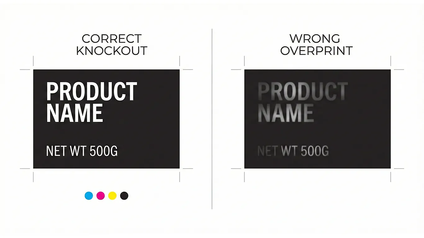
- Contrast wins. Dark text on light backgrounds (or vice versa). Avoid text across photos or metallic without white underprint.
- Type sizes that survive print. As a practical floor, aim ≥6 pt on labels and ≥7–8 pt on boxes for body text (check your category rules).
- Don’t cross folds. Keep small copy away from creases, tight radii, and glue.
Future-proof without redesigning
- Leave a parking space. Reserve a clean area for a third language or a country-specific line so you’re not squeezing later.
- Template the style. Same headings, same order, same spacing. Your team can drop in translations without rethinking layout.
- Plan for text growth. Hungarian and English expand differently—give lines room to breathe.
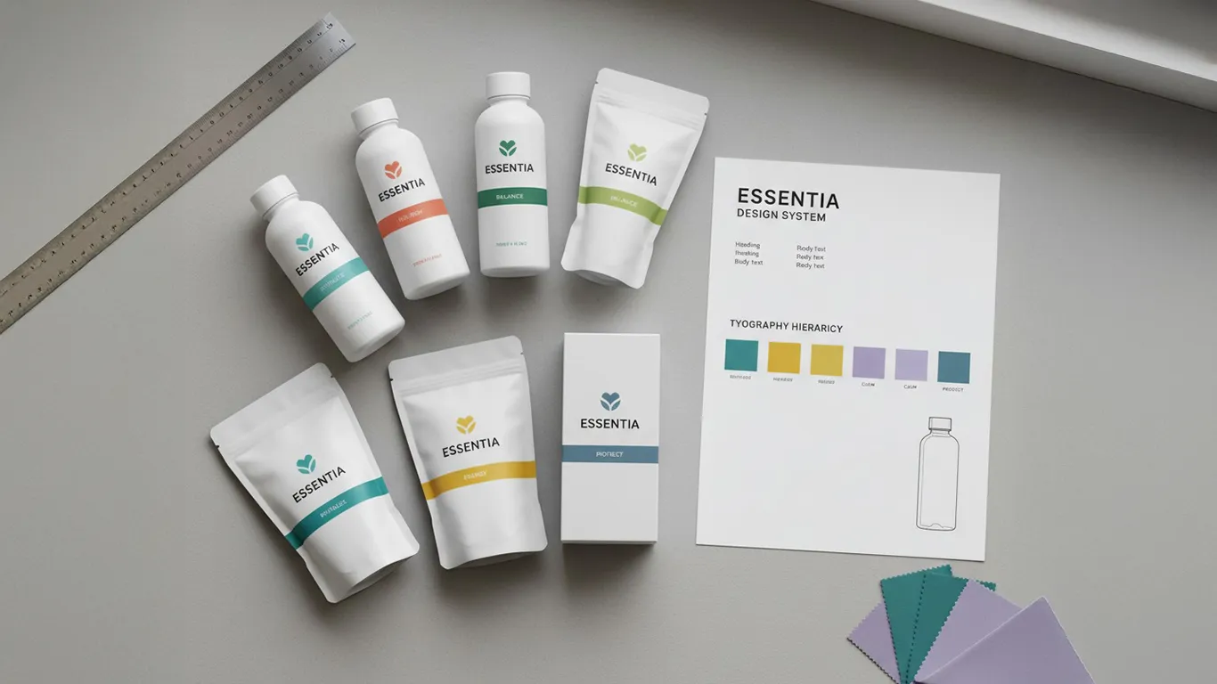
- Add rules to your brand book. Keep HU/EN examples, minimum sizes, and icon usage in your online brand book (WordPress/Elementor, hosted on your server) with downloadable assets.
Cost & production notes (keep budgets sane)
- Over-sticker when: volumes are small, markets are testing, or timelines are tight. Use the right adhesive and match the base finish (matte on matte, gloss on gloss).
- New SKU when: you’re in steady volume per market or the language forces a different legal layout. Cleanest result, often cheaper long-term.
- Proof on the real thing: coated vs uncoated, clear film with white ink, metallized with white knockouts. PDF isn’t enough.
- Avoid crowding. More languages often tempt smaller type—don’t drop below legible sizes; it costs more in reprints.
HU/EN placement checklist (copy-paste)
- Front shows brand + product + variant clearly in HU/EN (as required).
- Side/back groups Ingredients / Összetevők, Allergens / Allergének, Usage / Használat, Storage / Tárolás in consistent order.
- Allergens are bold within the ingredient line(s) in both languages.
- Nutrition table labeled HU/EN if applicable.
- Warnings and distributor details present in both languages.
- Barcode on a light, clean patch with quiet zone; not on a crease or across varnish bands.
- Minimum type sizes met; small text not sitting on folds or textures.
- Proof checked on actual stock/finish and scanned under store-like lighting.
Short-term wins (this month)
- Clearer labels without cramming; faster approvals from buyers and compliance.
- Fewer reprints caused by unreadable tiny text or missed translations.
- Smoother printer quotes—your files look organized and complete.
Long-term wins (this year)
- A repeatable template that scales from two to five languages without chaos.
- Stronger shelf recognition across markets.
- Lower design and prepress time per new country/version.