A rejected barcode or illegible nutrition panel can stop a product launch cold. Learn the technical rules of compliance design – from quiet zones to white underprints – so you can satisfy the retailer without sacrificing your brand aesthetic.
The buyer meeting is in two hours. You have a beautiful physical mockup in hand, the branding looks sharp, and you are ready to sell. Then, the notification pings: a red email from the compliance team. “Barcode won’t scan on the fridge line. Nutrition panel too small. Move the recycling mark.”
That sinking feeling isn’t about your taste levels – it is about compliance mechanics. The good news is that you do not have to choose between a design that sells and a design that scans. By understanding the physics of the scanner and the logic of the layout, you can weave mandatory data into your packaging without turning it into a legal textbook.
The Balancing Act: Hierarchy is Everything
Great packaging follows a strict visual hierarchy: Brand → Product → Variant → Claims → Mandatory Info. Compliance shouldn’t shout, but it can’t whisper either. The goal is to create distinct zones. If you try to hide the legal text by scattering it, you annoy the consumer and the retailer.
Instead, group your mandatory information (ingredients, nutrition, storage, distributor) into tidy, consolidated blocks. This is the foundation of a scalable packaging system – treating legal panels as fixed, functional zones so the rest of the pack can sing.
Barcodes That Scan First Time
The barcode is the cash register’s only connection to your product. If it fails, the retailer loses money, and you lose trust. Here are the three technical rules to lock in.
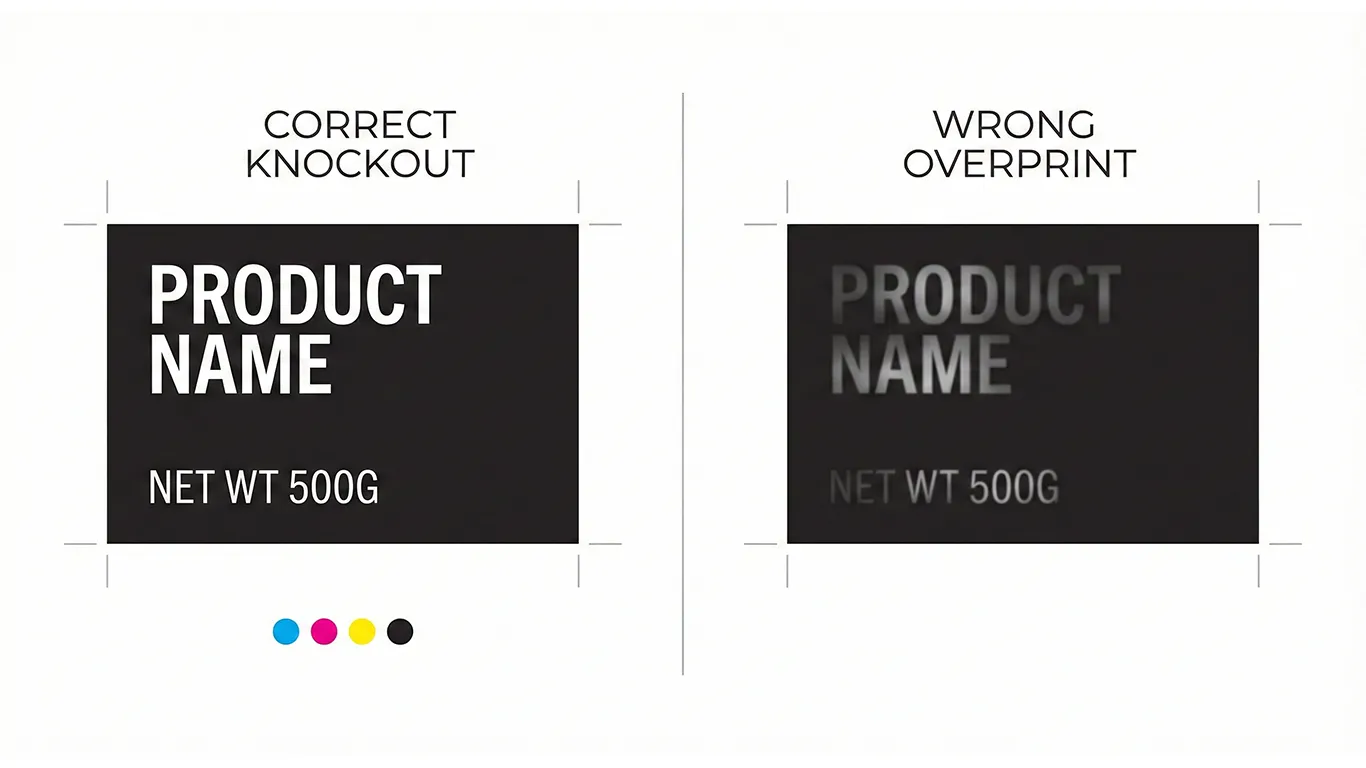
1. Contrast and Underprints
Scanners need high contrast. EAN/UPC codes should sit on a solid light background (white is always preferred). Never place a barcode over a photo, a gradient, or a busy texture. If you are printing on metallic foil or clear film, you must build a White Underprint block specifically for the barcode. Without this opaque white layer, the scanner laser will reflect off the foil or pass through the film, resulting in a failed read.
2. The Quiet Zone
The empty white space to the left and right of the bars is not “wasted space” – it is part of the code. It tells the scanner where the data begins and ends. Never encroach on this zone with text, frames, or graphics.
3. Orientation and Distortion
On curved containers (pouches, cans), organize your barcode in a “picket fence” orientation (bars vertical). This resists distortion better than a “ladder” orientation (bars horizontal). Also, be wary of spot gloss varnishes; a glossy line cutting through a matte barcode can confuse the laser.
Legal and Nutrition: Legibility is a Spec
Small text doesn’t have to be painful to read. It just needs clean fonts and solid contrast. As a general rule of thumb, avoid going below 6pt on labels and 7-8pt on carton board for body legal text (always confirm your local market regulations). To keep it readable, use generous line spacing rather than squashing the text block.
Keep in mind that small text is vulnerable to “dot gain” (ink spread). If you use a thin font on a porous cardboard box, the ink will bleed and fill in the letters. For detailed advice on setting up text that survives the press, review our guide on File Hygiene for Packaging.
The 3D Reality: Boxes and Folds
If you are designing folding cartons, you must design with the dieline open. A common mistake is placing critical legal info or a barcode across a score line or a glue flap. When the box is assembled, that information disappears or becomes unreadable.
- Plan for the Bulge: On soft pouches or over-filled boxes, avoid placing the barcode near the edge where the pack curves away.
- Respect the Glue: Keep mandatory text well away from crash-lock bases and side seams.
- Secondary Scanners: If your retailer often stocks boxes sideways, check if they require a second barcode on a side panel.
Before you commit to a layout, always reference your Dielines & Bleed specs to ensure your compliance data sits on a flat, safe panel.
Short-Term Wins (This Week)
- **Faster Approvals:** Fewer rejected proofs means you get to market faster.
- **Cost Savings:** No emergency reprint costs due to non-scanning barcodes.
- **Retailer Confidence:** Your product scans instantly at the warehouse receiving dock.
Final Thought
Compliance shouldn’t hijack your design, and design shouldn’t hide compliance. They are partners in a successful product launch. By respecting the technical constraints of the scanner and the press, you create a package that looks premium on the shelf and performs perfectly at the checkout.
Need a fast compliance pass?
I can audit your barcodes, nutrition panels, and dieline placement before you hit print.