Two jars sit side by side on the shelf. Same brand, same design. One looks rich and confident; the other looks a little flat and tired. The difference isn’t the artwork—it’s the material and finish.
This is why I spend time on substrates and finishes with every client. They change how colors print, how the pack wears, and how the product feels in a customer’s hand. Here’s a plain‑English guide to choosing them well—so your packaging looks great on day one and still looks great on day 101.
The Stock Sets the Mood
Coated vs. uncoated paper.
Coated stock (gloss/matte) holds ink on the surface—colors print cleaner and more saturated. Uncoated stock absorbs more ink—great for a natural, tactile look, but colors print softer and darker. If you want bright color on uncoated, plan for it in the files and proof on the actual stock.
Kraft & tinted stocks.
Brown kraft and tinted papers shift color immediately (there’s no “white” behind your ink). Lean into that look with high‑contrast, simple palettes—or use white ink to reclaim brightness in key areas.
Films: PP / PE / PET.
Films are durable and moisture‑resistant—ideal for beverages, refrigerated goods, and cosmetics. They also change how ink sits on the surface and how labels conform to curves. On clear films, white ink becomes your best friend (more on that below).
Finishes Change Both Look and Lifespan
Varnish vs. lamination.
- Varnish (gloss/matte/soft‑touch) is printed like ink—good protection, lower cost.
- Lamination is a thin film bonded to the surface—stronger against scuffs, moisture, and oils. For cold chain or heavy handling, lamination often wins.
Gloss vs. matte.
Gloss gives punch and sharpness (great for color and small type). Matte looks premium but dulls colors a touch and can show rub marks. Many “premium matte” packs pair matte lamination with spot gloss to add contrast where it counts.
Soft‑touch.
Beautiful in hand, but it can scuff. Use on hero panels, not full‑wraps that face friction.
Foil, emboss, spot UV.
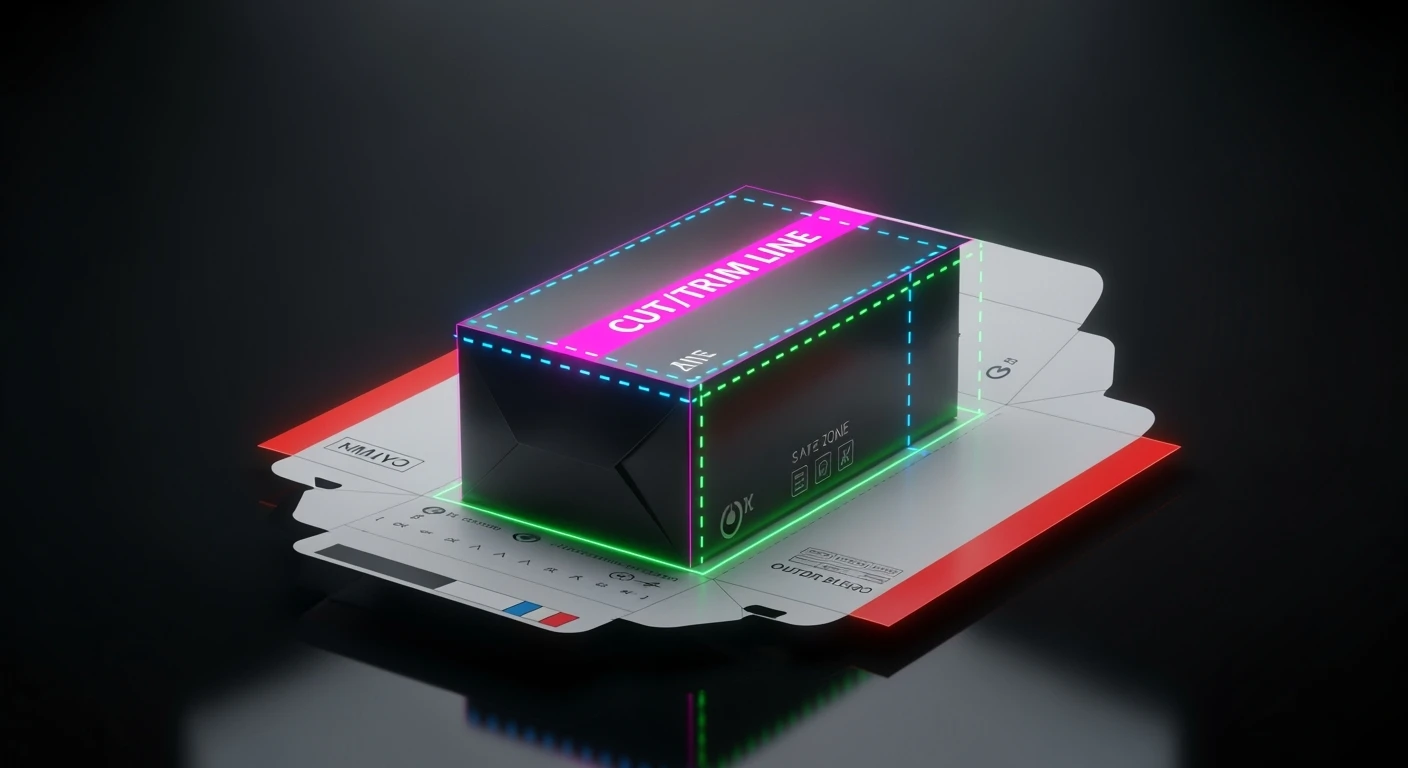
Foil (hot/cold) adds metal shine; emboss/deboss adds relief; spot UV gives raised gloss. Keep effects inside safe areas—don’t run them across deep creases or tight radii where cracking can happen.
White Ink, Metallics & Clear Labels
Clear labels on glass or PET.
Without a white underprint, colors look see‑through and dull. Use a white ink layer under logos/text and let glass show through where you actually want transparency.
Metallized paper/film.
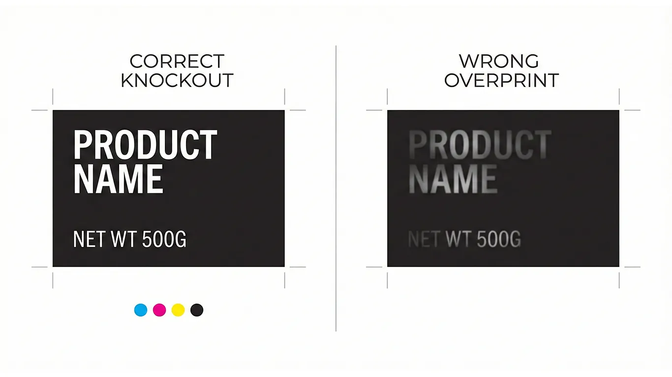
You can create selective metal shine by knocking out the white behind areas you want to shine and printing opaque color where you don’t. Remember: barcodes and tiny text should sit on white for scan/readability.
Wet, Cold, and Real‑World Handling (Beer wisdom included)
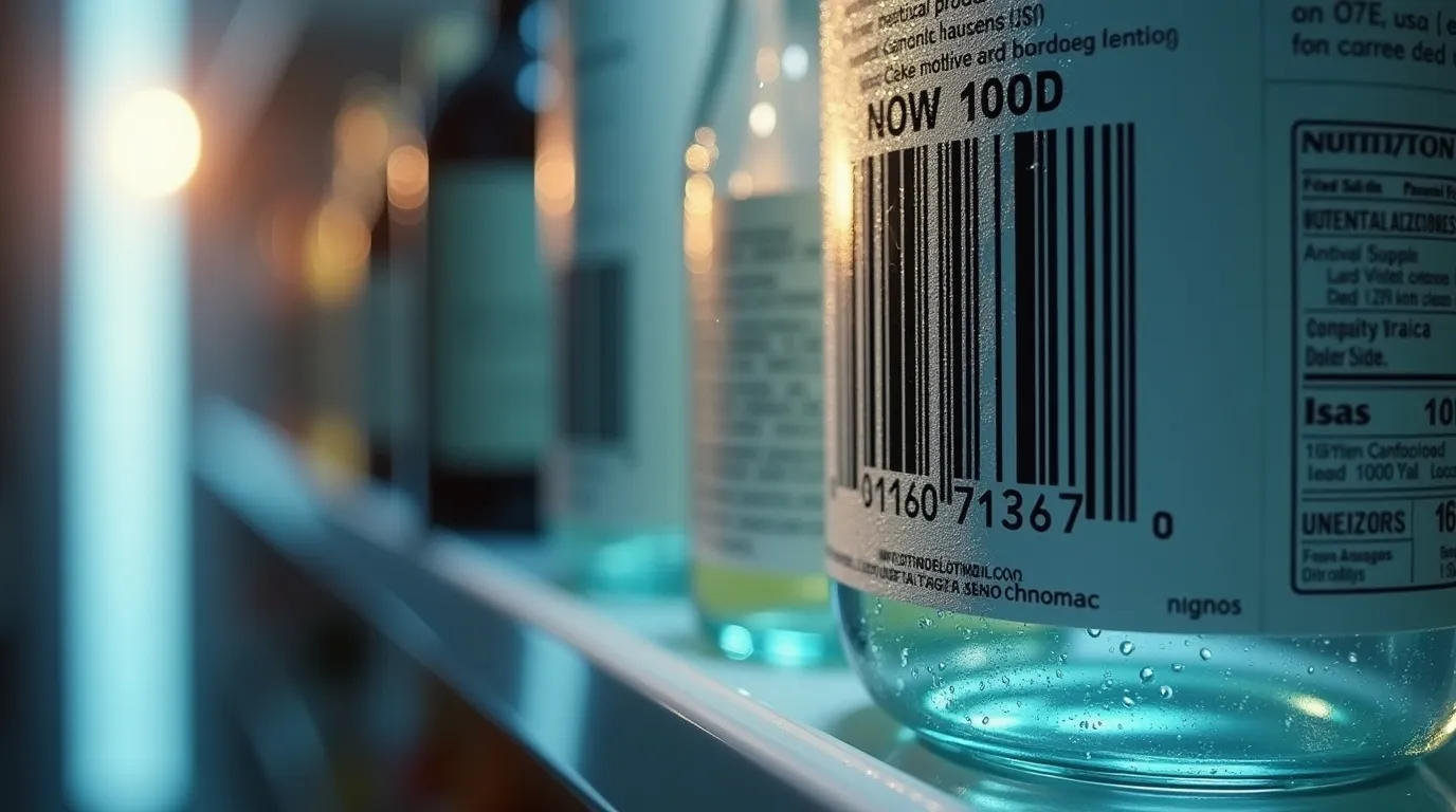
- Condensation is real. In fridges and ice buckets, paper soaks, inks rub, adhesives fail. Choose film labels, moisture‑resistant adhesives, and lamination (not just varnish).
- Curved surfaces. On cans and bottles, choose conformable films (PE/PP) and watch for label lift on tight curves and near seams. Short neck labels love to curl—spec the right adhesive and grain direction.
- Oils & cleaners. For cosmetics or kitchen goods, fingerprints and oils show on matte; gloss or laminated matte wears better.
Where to Splurge, Where to Save
- Splurge: hero SKUs, gift editions, and key shelf‑facing panels where touch and light matter. Upgrades like soft‑touch (in moderation), spot gloss, or foil can lift perceived value.
- Save: back labels, inner panels, or shipper boxes. Put budget where customers make decisions—front panels, variant cues, and finishes they’ll actually feel.
A Simple Conversation With Your Printer (Before You Commit)
Ask for:
- Stock recommendation for your use (coated/uncoated/kraft/film) and environment (ambient/fridge/freezer).
- Finish comparison (varnish vs. lamination) with handling expectations.
- White ink plan for clear/metallic applications.
- Proof on the real thing (not just a color swatch). A drawdown or short test run beats guessing.
If you’re in Hungary, I can run those tests in‑house and hand over dialed‑in specs to your volume printer when you scale.
Final Thought
Materials and finishes are part of the design—not an afterthought. Choose them well and your brand feels clearer, tougher, and more valuable, without overspending. Choose them blindly and the same artwork can underperform or wear out fast.
Need help testing stocks and finishes for your product? I can prototype on real materials, then lock specs for smooth reorders.
